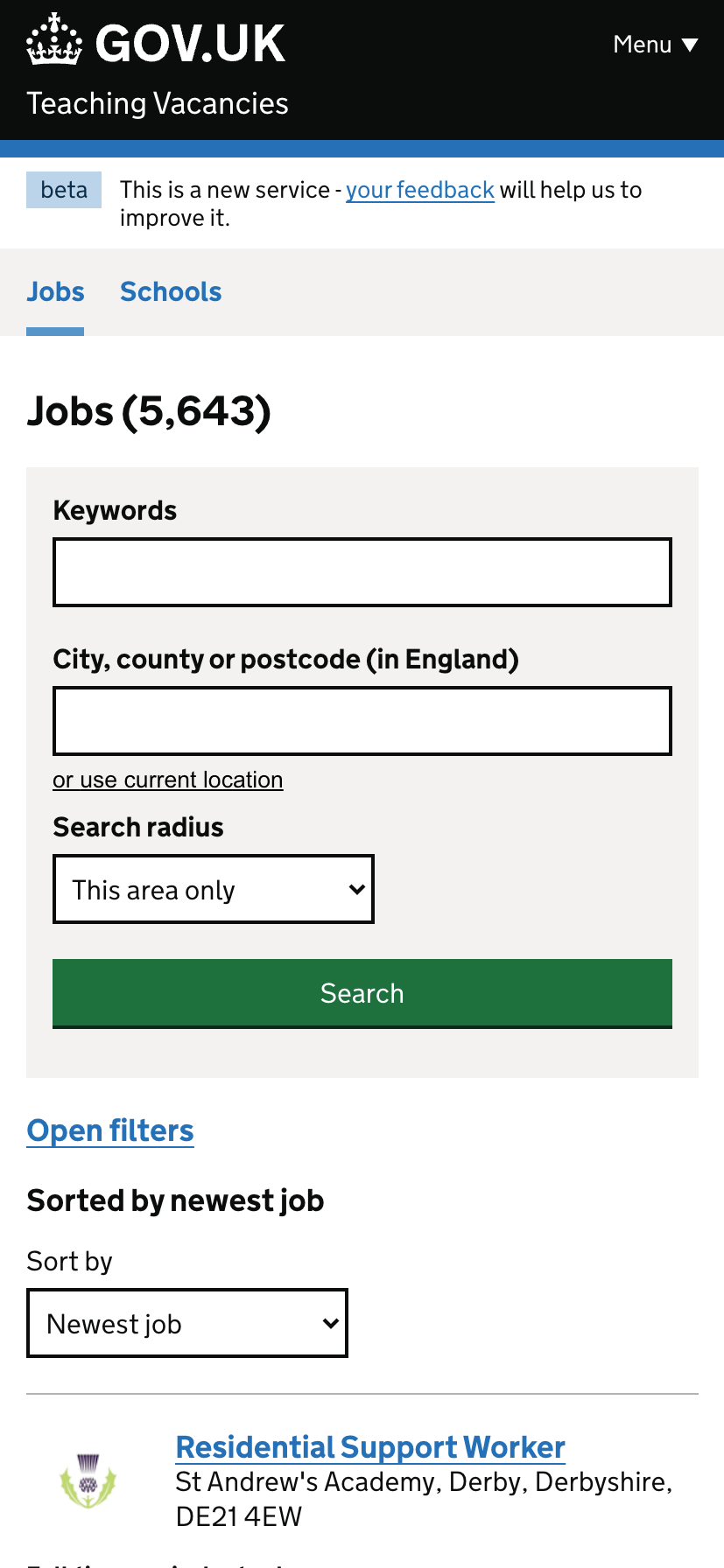
Research and feedback have shown that mobile phone users often miss our filtering options on the job search page. This is problematic for everyone looking for specific filters, which exist but are not easily found on mobile devices.
To address this issue, we made some changes to improve the visibility of the filters’ call to action on mobile, such as:
- replacing the’Open filters’ grey button with a blue hyperlink to make the filters more obvious.
- mirroring this design on both the jobs page and the schools page.
- increasing the spacing around the “or use current location” call around action on both the jobs page and schools page
- increasing the spacing around the “open filters” call to action on both the jobs page and schools page
We will monitor the change to see if this improves the use of filters on mobile.
# User needs
Need JN001
ValidatedAs a jobseeker
I need to easily understand a job listing
So that I know whether it’s suitable
Need JN008
ValidatedAs a jobseeker
I need to know about the different types of roles
So that I can consider a wider range of jobs
# Screenshots