We’ve recently introduced the ability for people to apply for jobs in our service and for hiring staff to manage these applications. This has significantly increased the complexity of what a job is within our service.
We realised that our current interface would not be able to scale to allow hiring staff to complete the following tasks in a consistent location:
- manage jobs (delete/edit/copy/extend deadlines)
- collect and manage applications (view/shortlist/reject)
- view a job’s statistics (views/saves etc)
- view diversity data collected in the application process
# Updating the jobs dashboard
# The problem
Previously users accessed all job related tasks from their main jobs dashboard, and managed applications for a job in a separate screen.
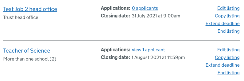
Text within each dashboard row was all a similar size, the lack of typographic hierarchy made it hard to establish an order of importance within the content. Some links were actions (for example, ‘edit listing’ or ‘extend deadline’) and others were navigation based (for example the titles of the jobs),. This made it difficult for the user to distinguish what the purpose of each link was.
In addition, the same link appeared many times in each row (for example, ‘edit listing’ appeared for each job) which created a less than ideal experience for assistive technology users.
This jobs dashboard represented the ‘hub’ in a ‘hub and spoke’ information architecture pattern. While this was sufficient at the time it was built, with more things now being associated with a job we needed to move towards a hierarchical structure.
# What we did
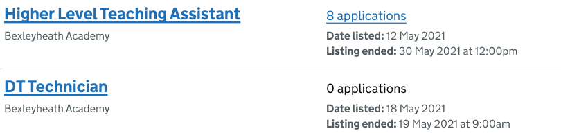
The newly designed jobs dashboard is much simpler. There is one clear primary call to action - the job title.
When the user clicks on each job title they are taken through to a job page. On this page they can take all the actions associated with the job, such as editing the listing or extending the deadline.
# Introducing job pages
Each job now has a unique page in the jobs dashboard with all data and tasks associated with a job consolidated in one place. The underlying intention is:
- improved structure in our information architecture
- a simplified mental model for hiring staff
- a flexible and scalable area for all things related to a job
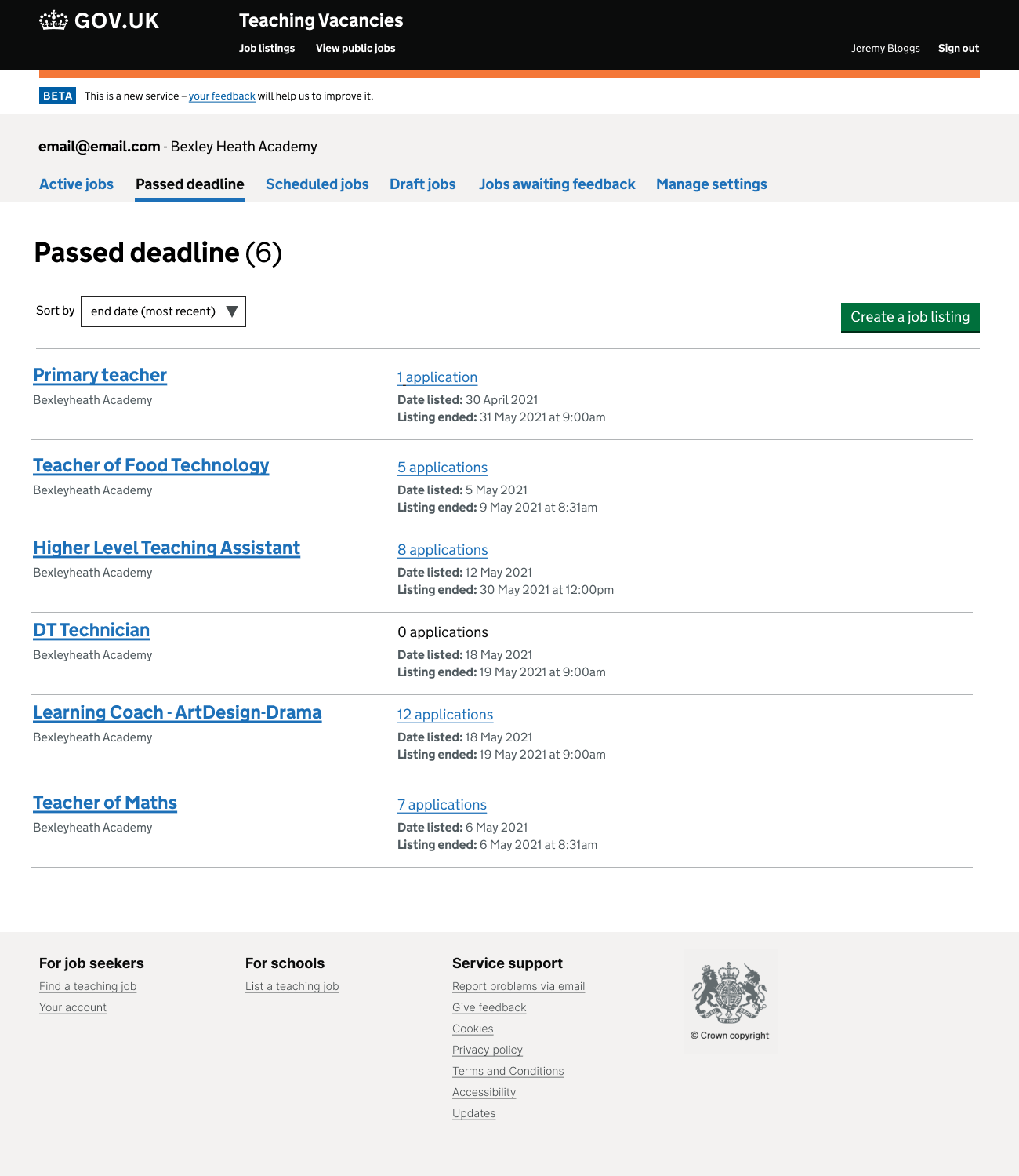
A job list (Figma export)
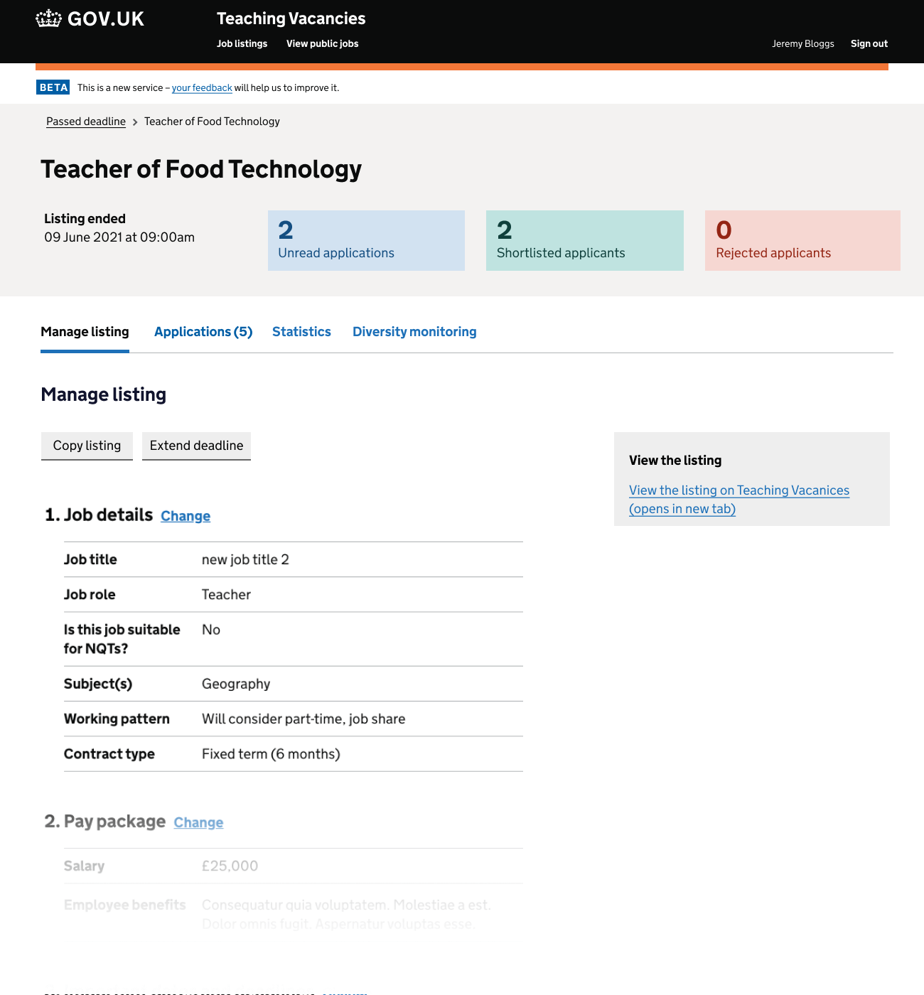
Manage a listing (Figma export)
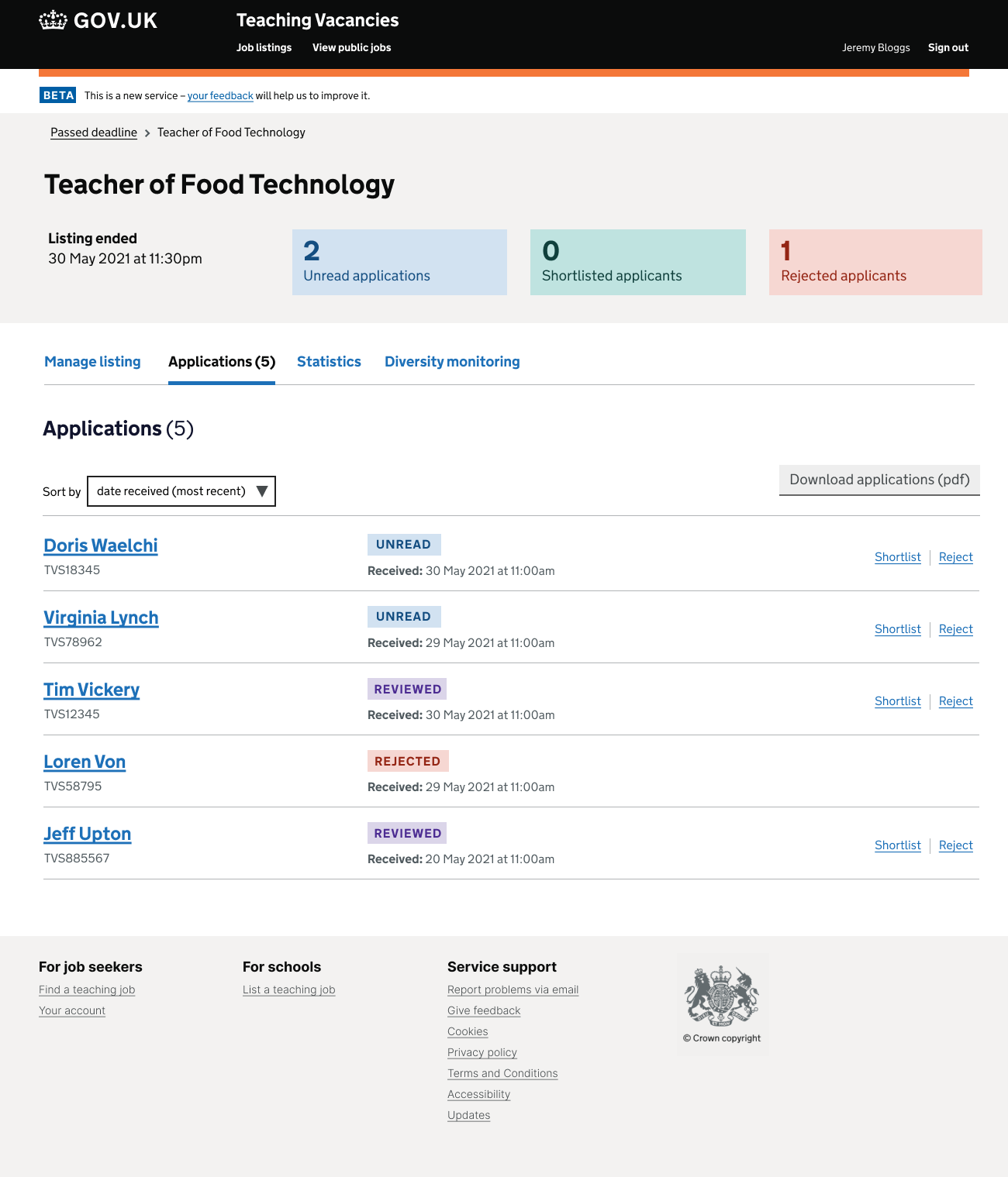
View applications (Figma export)
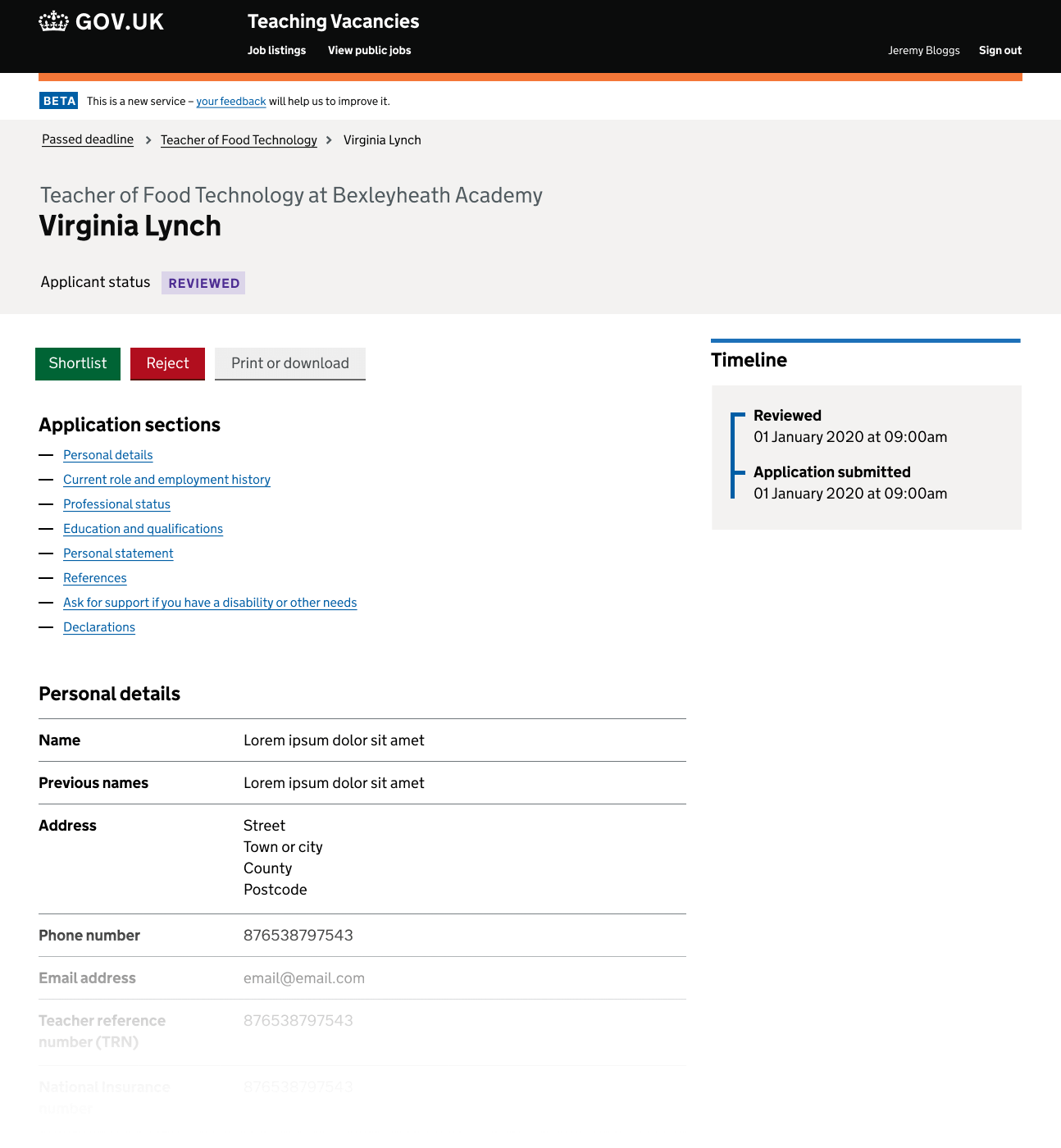
Review and manag an application (Figma export)
# Next steps
We now plan to iterate the flow for managing an application.
- consider how to allow hiring staff to mark an applicant as ‘hired’
- revisit the business rules for when an application becomes ‘reviewed’
- when hiring staff shortlist or reject an applicant they will be able to choose whether the applicant is notified (at the moment these emails are sent automatically)