Research shows that users find creating a job listing problematic for many reasons so we have made several changes.
# User needs
Need HN001
ValidatedAs a hiring staff user
I need to be able to create a job listing
So that jobseekers can find jobs at my school
Need JN001
ValidatedAs a jobseeker
I need to easily understand a job listing
So that I know whether it’s suitable
# Measuring success
We’ll consider these changes to be successful if:
- more job listings are using the service’s application form
- feedback is more positive about the process of creating a job listing
- feedback is more positive about the job listing
- more applications are made to jobs
- time spent creating a job listing is reduced
- the amount of out of scope roles are reduced
# What we changed
# Page headings and question labels
Previously, each page in the flow had a:
- h1 heading - for example, ‘Create a job listing for Bexleyheath Academy’
- h2 heading - for example, ‘Job role’
After the heading, there was a label for the form field. For example, ‘What is the job role?’.
This meant there were a lot of headings and unnecessary duplication.
To simplify this, we removed the h1 heading and combined the label and h1 together. For example, for the question about job role, there’s a single h1 heading and label that says ‘Role’.
Most questions are written as statements. This usually means they’re frontloaded and more concise.
# Progress indicator
Previously, every step showed a progress indicator which included all 10 steps in the flow.
However, we now have sections that are conditional. For example, the user is only asked to upload a PDF application form if they choose to receive applications like this.
This means we cannot present this accurately within the progress bar.
We plan to use the task list pattern. But as that’s a lot of effort to build, as a temporary solution, we’ll use captions to show the user where they are in the flow, for example ‘Section 1 of 4’.
# Submit buttons
Previously, all the pages had:
- a primary submit button labelled ‘Continue’
- a link labelled ‘Cancel and return to manage jobs’
- a paragraph that said ‘If you click cancel you will lose any unsaved information from this step. Completed details from previous steps will be saved in your draft jobs.’
We changed the primary submit button to ‘Save and continue’ and removed the paragraph because this makes it clearer what action is being taken
We added a ‘Save and finish later’ secondary button next to the primary button to make it clearer that this is possible
We moved the cancel link to below the submit button and changed the label to ‘Cancel’ as it’s more concise and makes room for the submit buttons
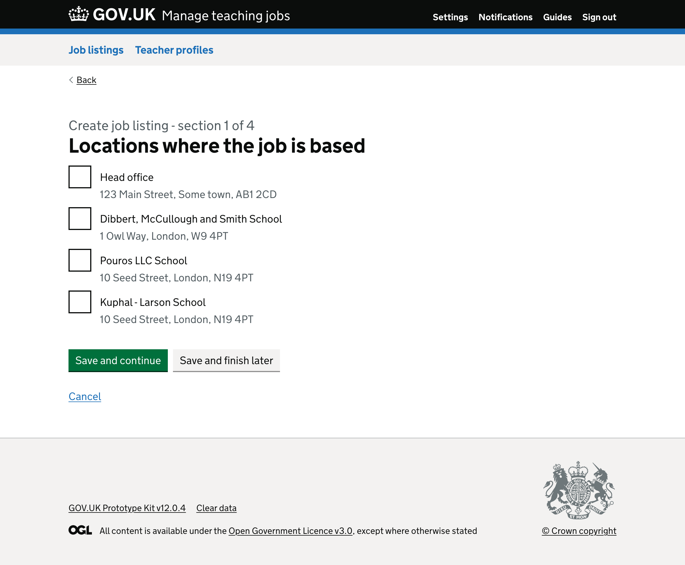
# Locations at multi academy trusts (MAT) and local authorities (LA)
Previously, users who belong to organisations with multiple locations were asked where the job will be based. The options were:
- At one school in the organisation - this takes users to a page with a list of locations as radio buttons
- At the organisations’ head office - this takes users to the job details page
- At more than one school in the organisation - this takes users to a page with a list of locations as checkboxes
This is long winded and unnecessary. So we changed this so that users are only asked to select a location where the job is based.
Options are given as checkboxes and include the head office and the schools within that organisation.
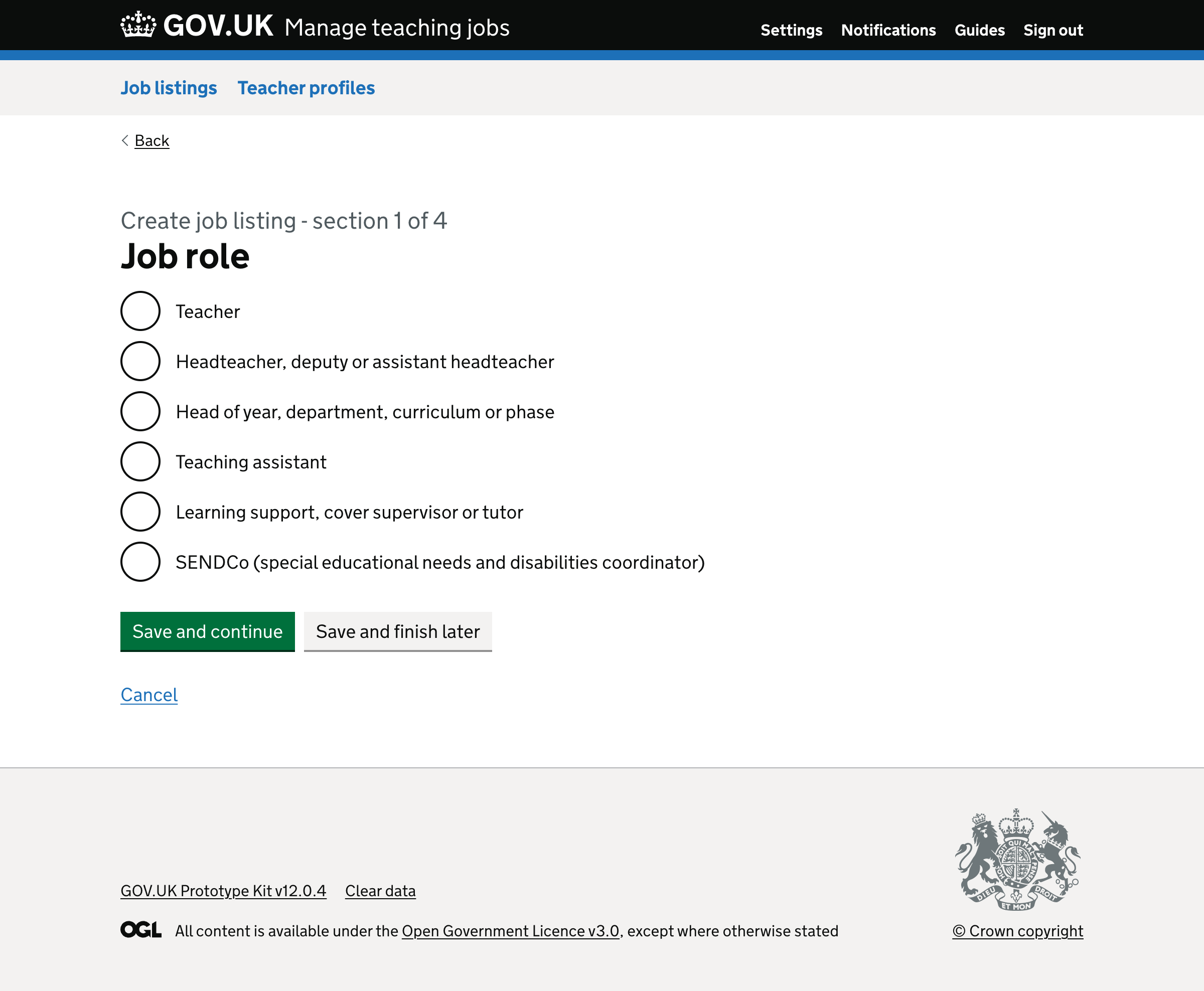
# Role labels
Previously, users were given options for:
- Teacher
- Leadership
- Middle leader
- Teaching assistant
- Education support
- SENDCo
Apart from ‘Teacher’, each option had hint text to describe the role. However, users often ignore hint text and it’s a sign that the labels are not clear enough.
For example, some schools used the ‘Education support’ category to go on to search for a kitchen chef, which is out of scope and does not match the role.
So, we decided to remove the hint text and change the labels to be more descriptive:
- Teacher
- Headteacher, deputy or assistant headteacher
- Head of year, department, curriculum or phase
- Teaching assistant
- Learning support, cover supervisor or tutor
- SENDCo (special needs and disabilities coordinator)
# Changing the way we ask if the role is suitable for early career teachers (ECT) and requires SEND experience
Previously, hiring staff could tell us if the role was suitable for early career teachers (ECT) or required SEND experience by selecting optional checkboxes:
- Suitable for early career teachers
- SEND responsibilities (special needs and disabilities)
These labels are vague and the options are not related.
The ‘suitable for early career teachers’ was not working well because:
- ECTs who view a job that’s not specifically for ECTs do not have confidence that they’ll get the job
- hiring staff users will select this option to increase their reach even if they won’t in reality consider an ECT
So, we removed this question and added a new one that asks users to select the ‘Suitability for early career teachers (ECTs)’ with radio button options for:
- We’ll only accept an ECT
- We’ll consider an ECT
- We will not consider an ECT
We moved this question to the ‘About the role’ page.
Furthermore, some roles have additional SEND responsibilities, while others are specific SEND roles in special schools. Therefore, this option did not help jobseekers distinguish between these roles.
We’ll consider a better way to handle the SEND question in another iteration.
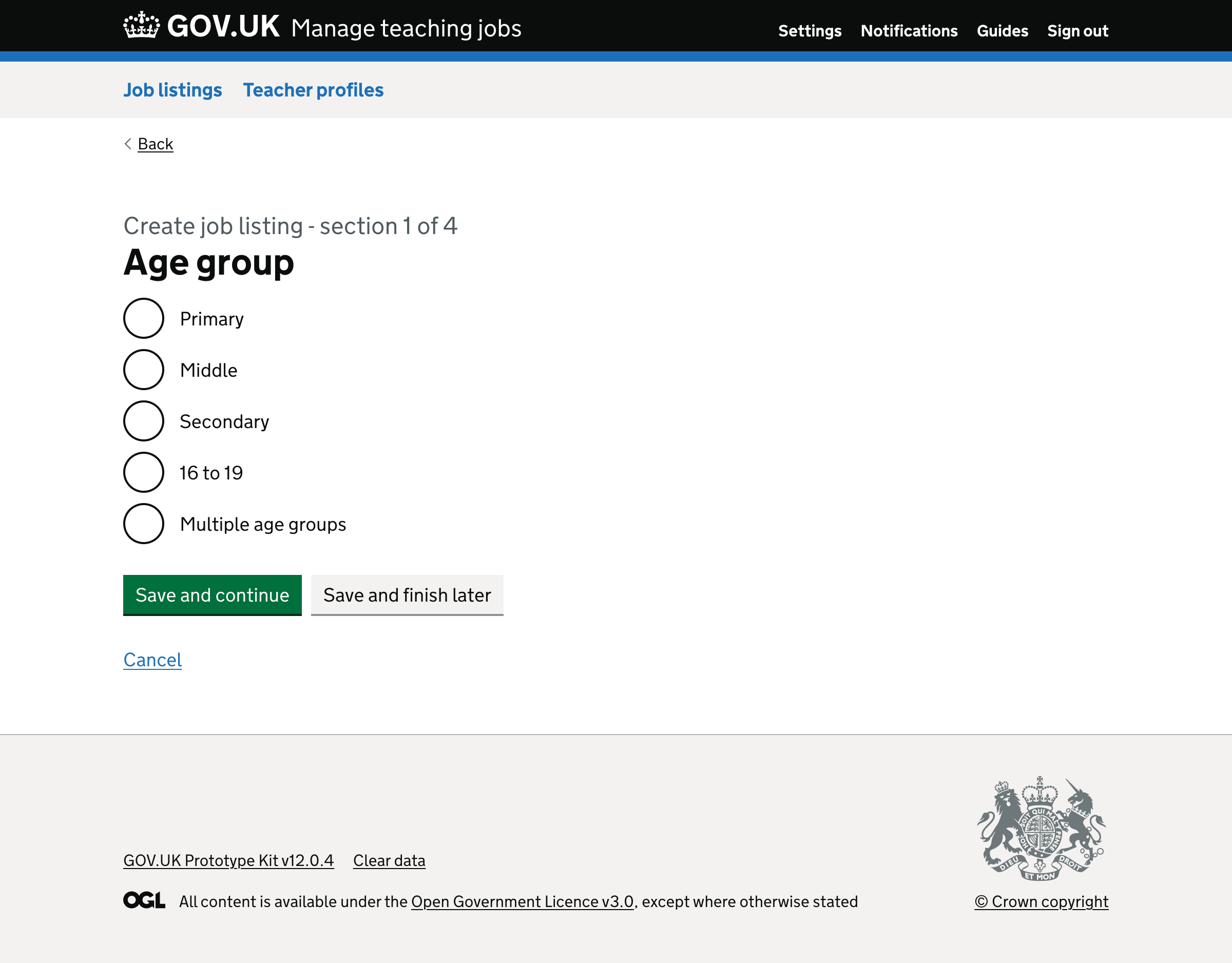
# Age group
Previously, when creating a job in a through school users were asked to specify the education phase.
The question was ‘What education phase will the role be covering?’ and had radio buttons options for:
- Primary
- Secondary
- 16 to 19
- More than one phase
We changed:
- the label to ‘Age group’, which is simpler and matches other teacher services that describe the same information
- ‘More than one phase’ to ‘Multiple age groups’, which is simpler and matches the label
We also removed ‘or’ as it’s unnecessary.
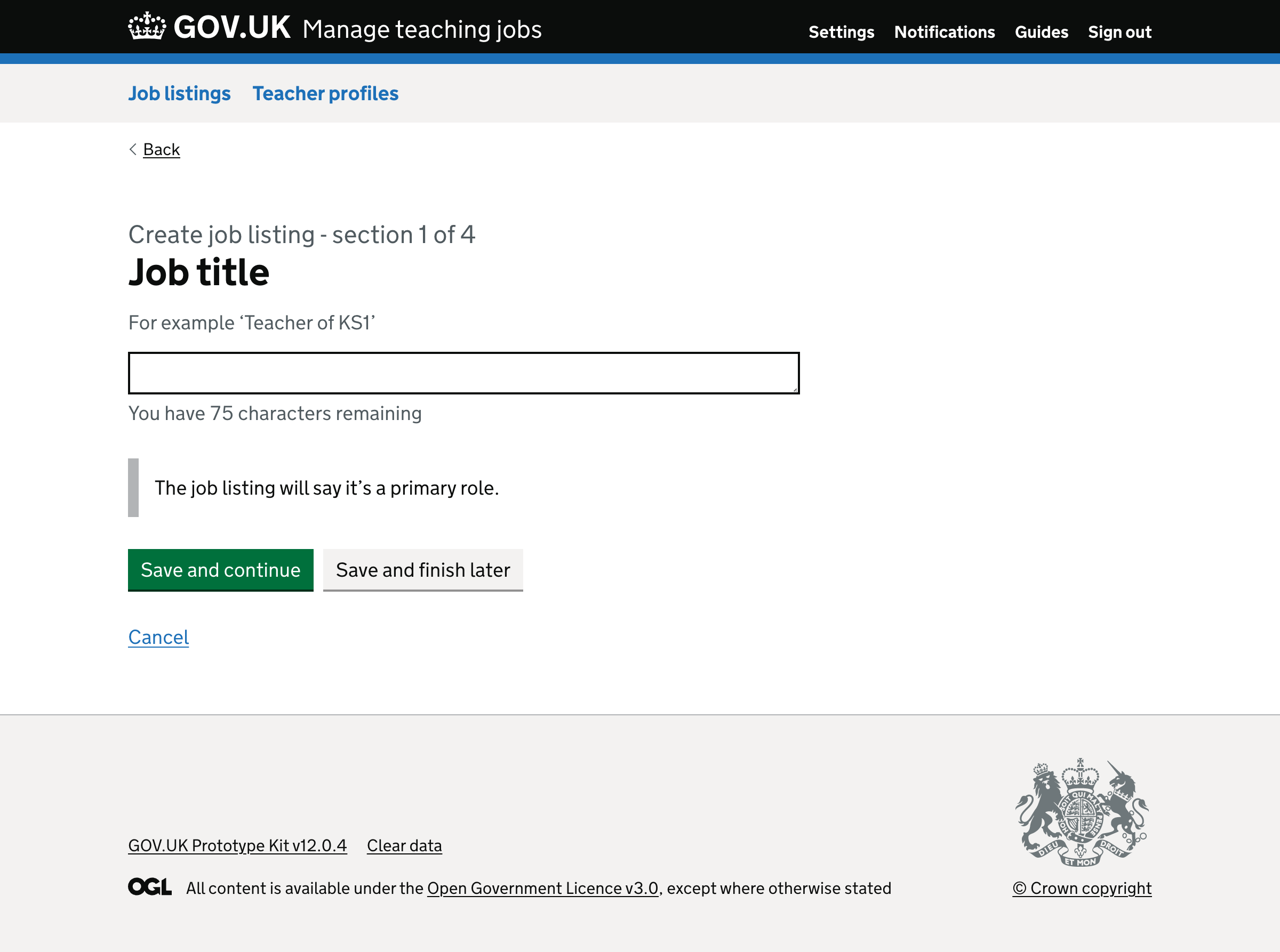
# Job title guidance
Some job titles were quite inconsistent. Some schools:
- entered long, complex job titles
- added details about the school in the title, such as phase or type of school
To simplify this, we decided to:
- include inset text that says, for example, ‘The advert will say that this is a secondary role’
- include hint text with an example of a clear and concise job title
The hint text will change based on the role and type of school.
| Role | Phase | Hint |
|---|---|---|
| Teacher | Primary | For example ‘Teacher of KS1’ |
| Teacher | Secondary | For example ‘Teacher of Maths’ |
| Headteacher, deputy or assistant headteacher | NA | For example ‘Assistant headteacher’ |
| Head of year, department or phase | Primary | For example ‘KS1 phase leader’ |
| Head of year, department or phase | Secondary | For example ‘Head of modern foreign languages’ |
| Teaching assistant | Primary | For example ‘KS1 teaching assistant’ |
| Teaching assistant | Secondary | For example ‘Level 2 teaching assistant’ |
| Learning support, cover supervisor or tutor | Primary | For example ‘KS2 learning mentor’ |
| Learning support, cover supervisor or tutor | Secondary | For example ‘SEND learning support assistant’ |
| SENDCo | NA | For example ‘SENDCo’ |
# Converting job titles to sentence case
Some job titles used uppercase text, which is harder to read.
We’ll now automatically convert job titles to sentence case, excluding words like ‘English’ and ‘KS1’.
For example:
- ‘TEACHER OF ENGLISH’ will be converted to ‘Teacher of English’
- ‘CLASS TEACHER KS1’ will be converted to ‘Class teacher KS1’
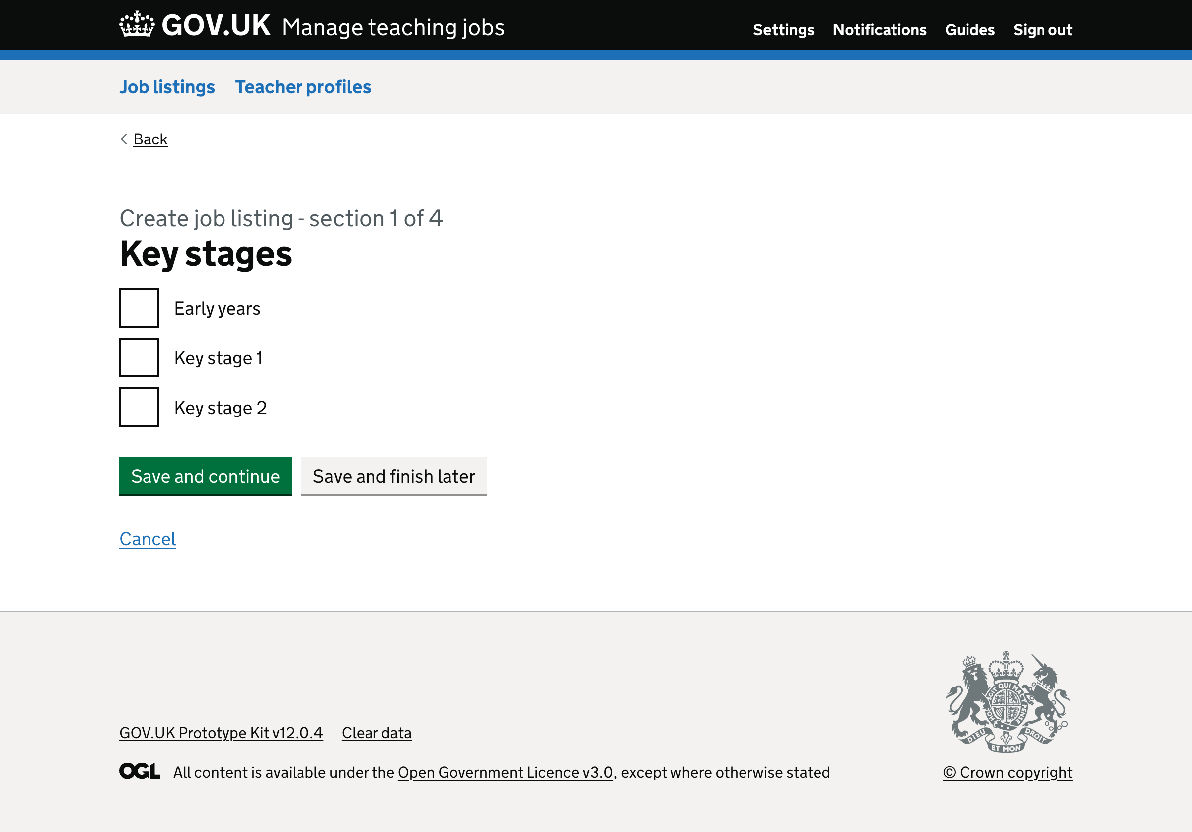
# Key stages
Previously, when advertising for roles in primary schools, the user was asked to select from the following optional key stages.
- Early years
- KS1
- KS2
We changed this so that the question is required, and asked for all types of school.
For primary schools, the options will include early years, KS1 and KS2.
For secondary schools, the options will include KS3, KS4, KS5.
For through schools, the options will include early years, KS1, KS2 KS3, KS4 and KS5.
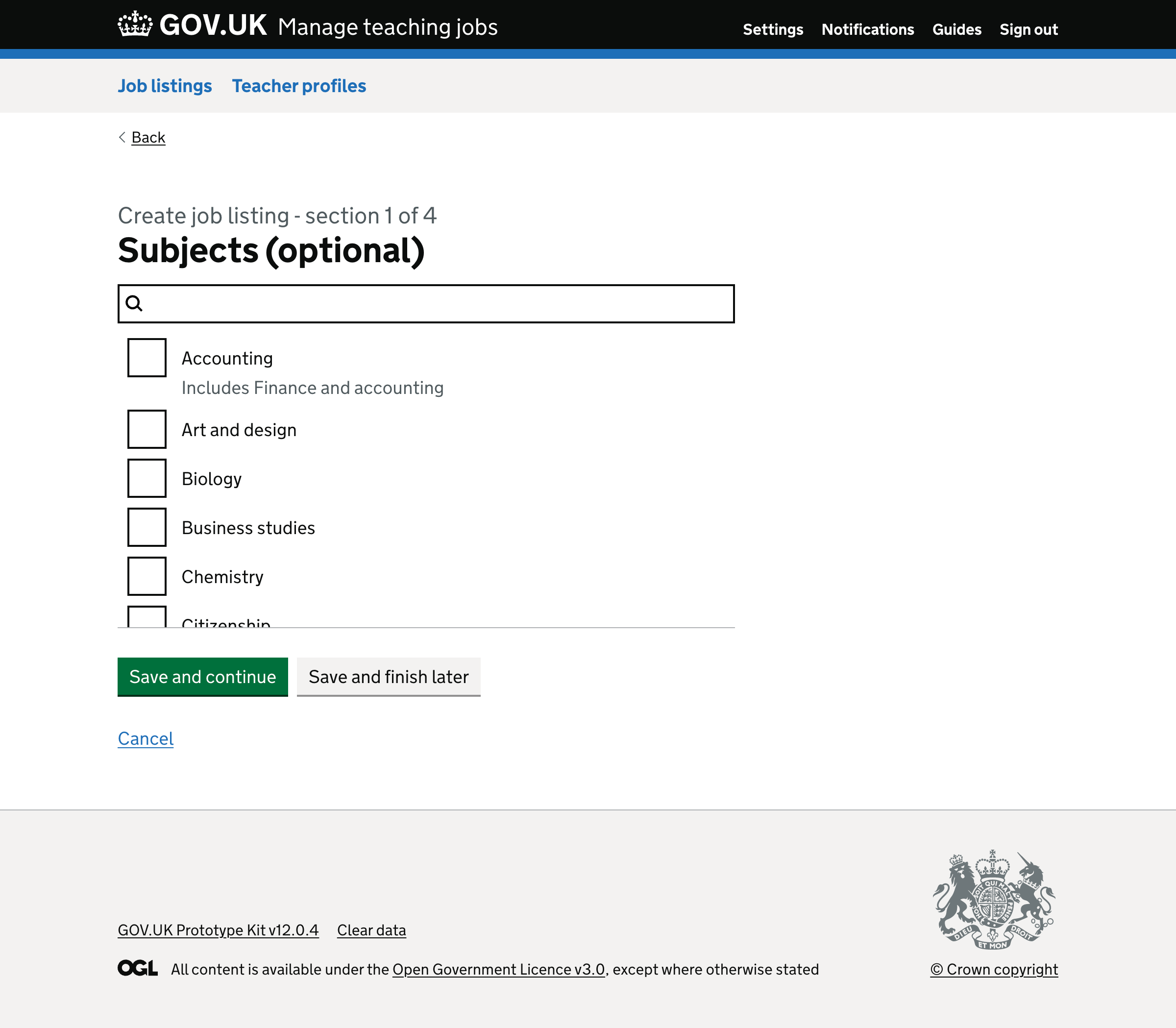
# Subjects
Previously:
- subjects were part of the ‘Job details’ page
- there was a hint that said ‘What subjects will the teacher focus on?’
- there was a border around the checkboxes, which is unnecessary
To simplify this, we moved the question to a separate page and removed the hint and border.
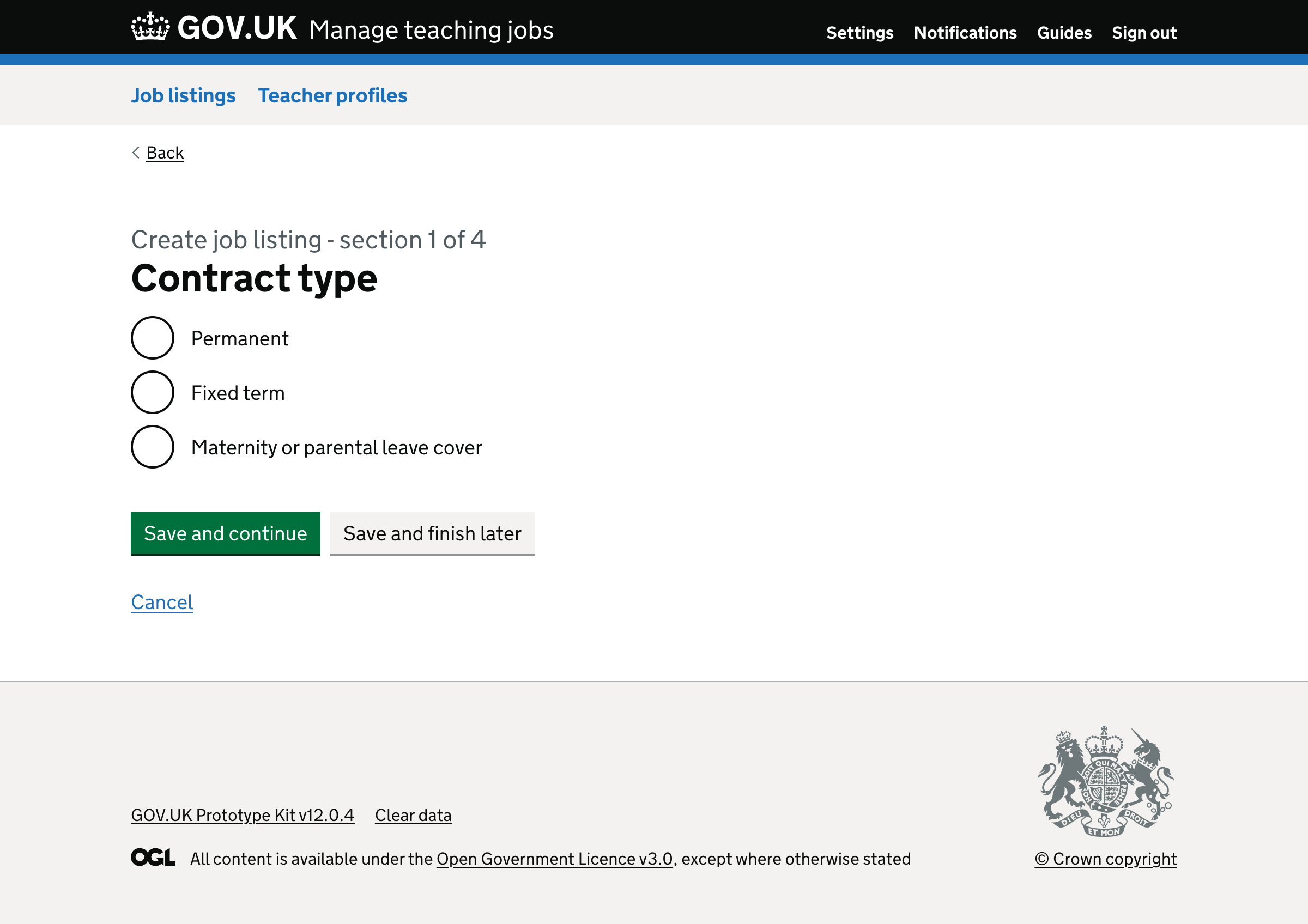
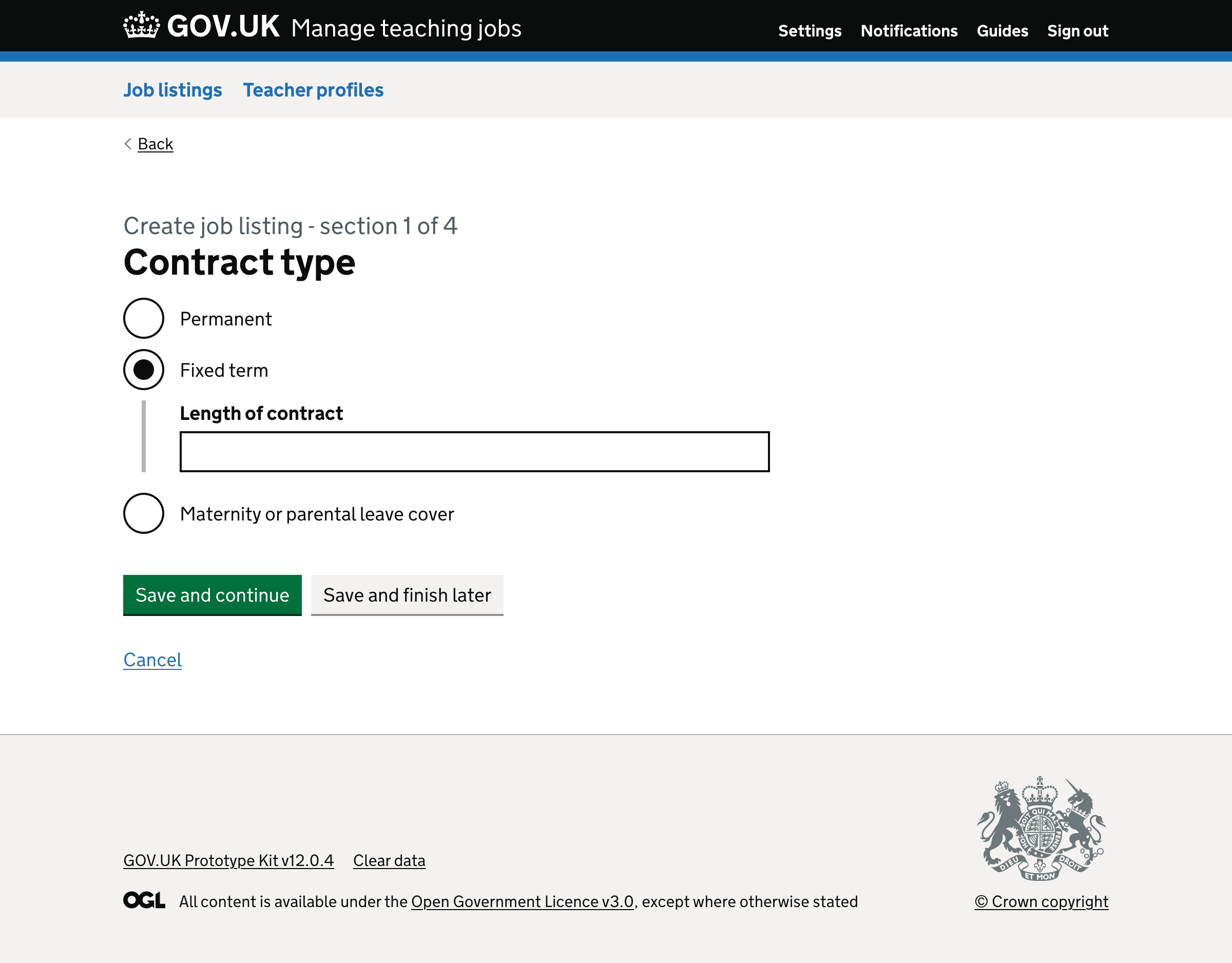
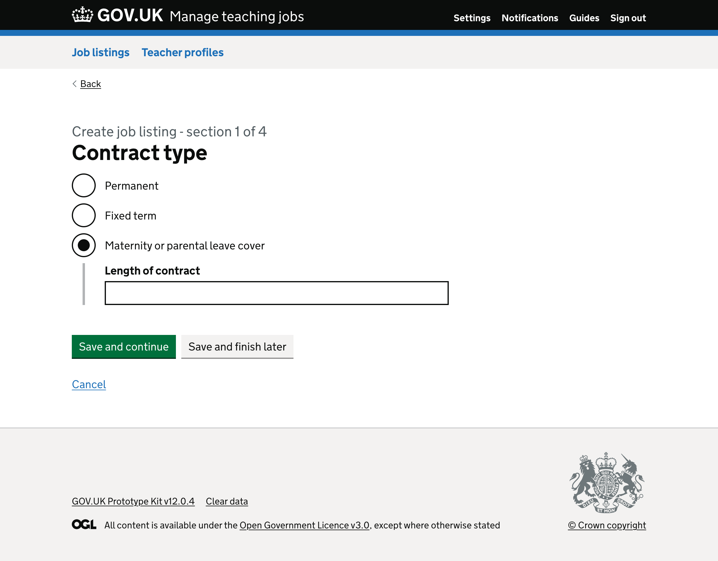
# Contract type
Previously, the contract type question was asked within the ‘Job details’ page.
It contained options for:
- Permanent
- Fixed term
- Maternity or parental leave cover
The ‘Fixed term’ and ‘Maternity or parental leave cover’ radio buttons:
- revealed a text input for duration of contract
- included a hint that said ‘Contract length should be more than 12 weeks. Short term cover should not be advertised on Teaching Vacancies’
We changed the label from ‘Duration of contract’ to ‘Length of contract’.
The hint is meant to stop users from adding supply jobs, which they’re not allowed to do.
But we decided to remove it because:
- users could indicate the job is a supply job in other fields
- users should be aware of this before they create a job listing
- we could make this clear on the check answers page
- very few supply roles are created
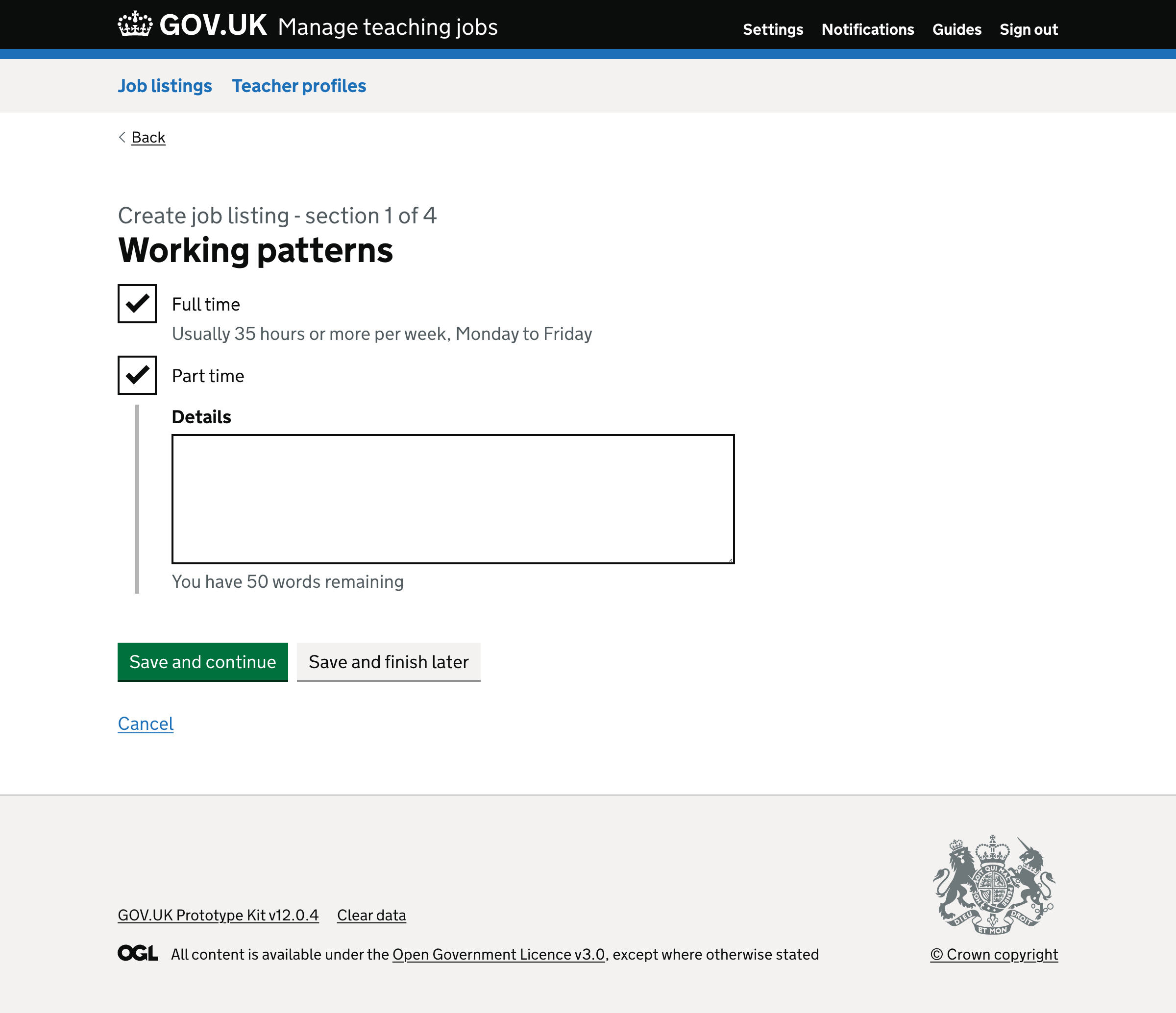
# Working patterns
Previously, this page had questions labelled:
- Working pattern
- What are the specifics of the working pattern? (optional)
Working pattern had checkbox options for:
- full time
- part time
- flexible (40 out of 3500 jobs)
- job share (40 out of 3500 jobs)
- term time (700 out of 3500 jobs)
Term time was added for support roles, but it’s being incorrectly used for teaching roles.
So, we removed the options for flexible, job share and term time.
And we added conditionally revealed free text boxes for both ‘Full time’ and ‘Part time’. This means the details users add relate to a specific working pattern.
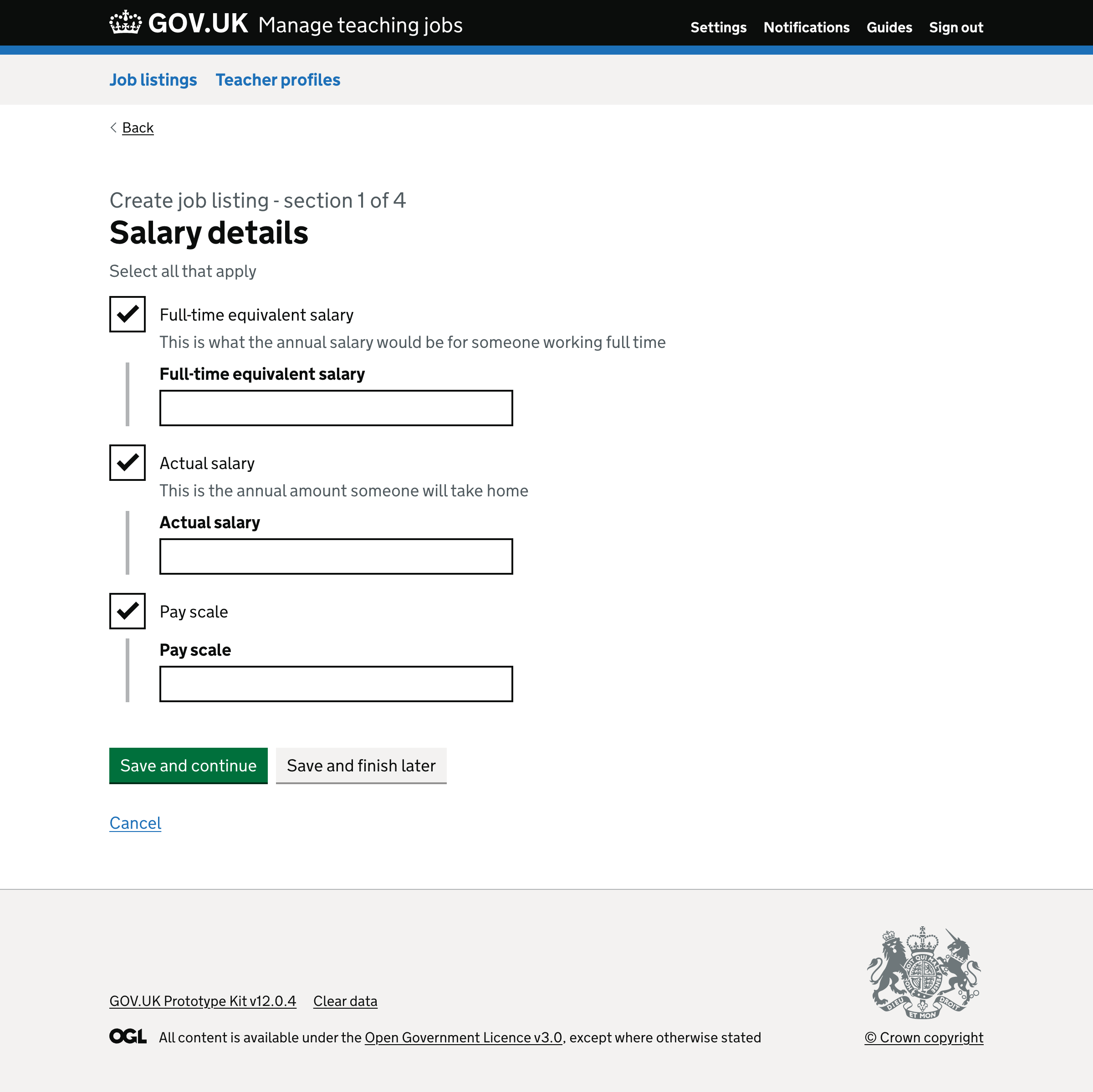
# Salary details
Previously, users were shown a page titled ‘Pay package’.
It contained a field for an annual or full time equivalent (FTE) salary. Users entered a lot of information such as gross pay, pro rata pay and pay scale information.
If the user selects part time, they’re also given a field for ‘Actual salary’, which is optional.
All of this shows up as a long piece of text that makes the job listing harder to read.
To simplify this, we changed the heading from ‘Pay package’ to ‘Salary details’. The question has checkbox options for:
- Full time equivalent salary
- Actual salary
- Pay scale
Each option reveals a text box to give details. Users must select at least one of these options.
This means that users can use the options that best suit their job listing. The job listing should be easier to read as we can show separate labels with shorter details.
There’s also a field for additional allowances that we removed because this is more to do with what the school can offer the teacher, which is covered later.
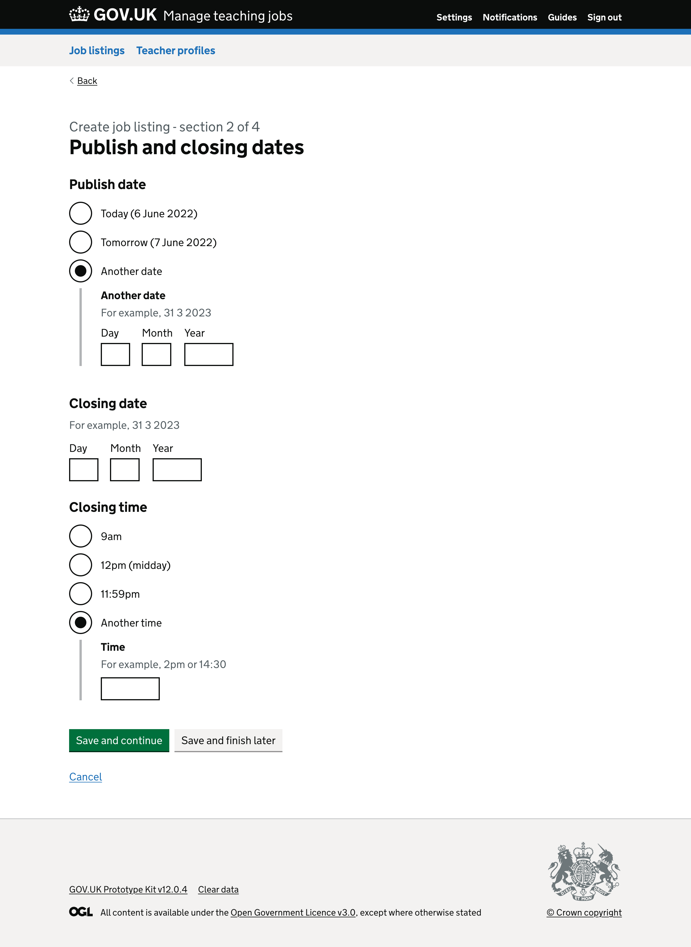
# Moving start date to a separate page
Previously, publish date, closing date and start date were grouped together on a page with a heading of ‘Important dates and deadlines’.
The role’s start date is not related to the publish and closing date, so we moved the start date to a separate page.
We changed:
- the name of the field from ‘Date job starts’ to ‘Start date’, which is more concise
- the heading from ‘Important dates and deadlines’ to ‘Publish and closing dates’
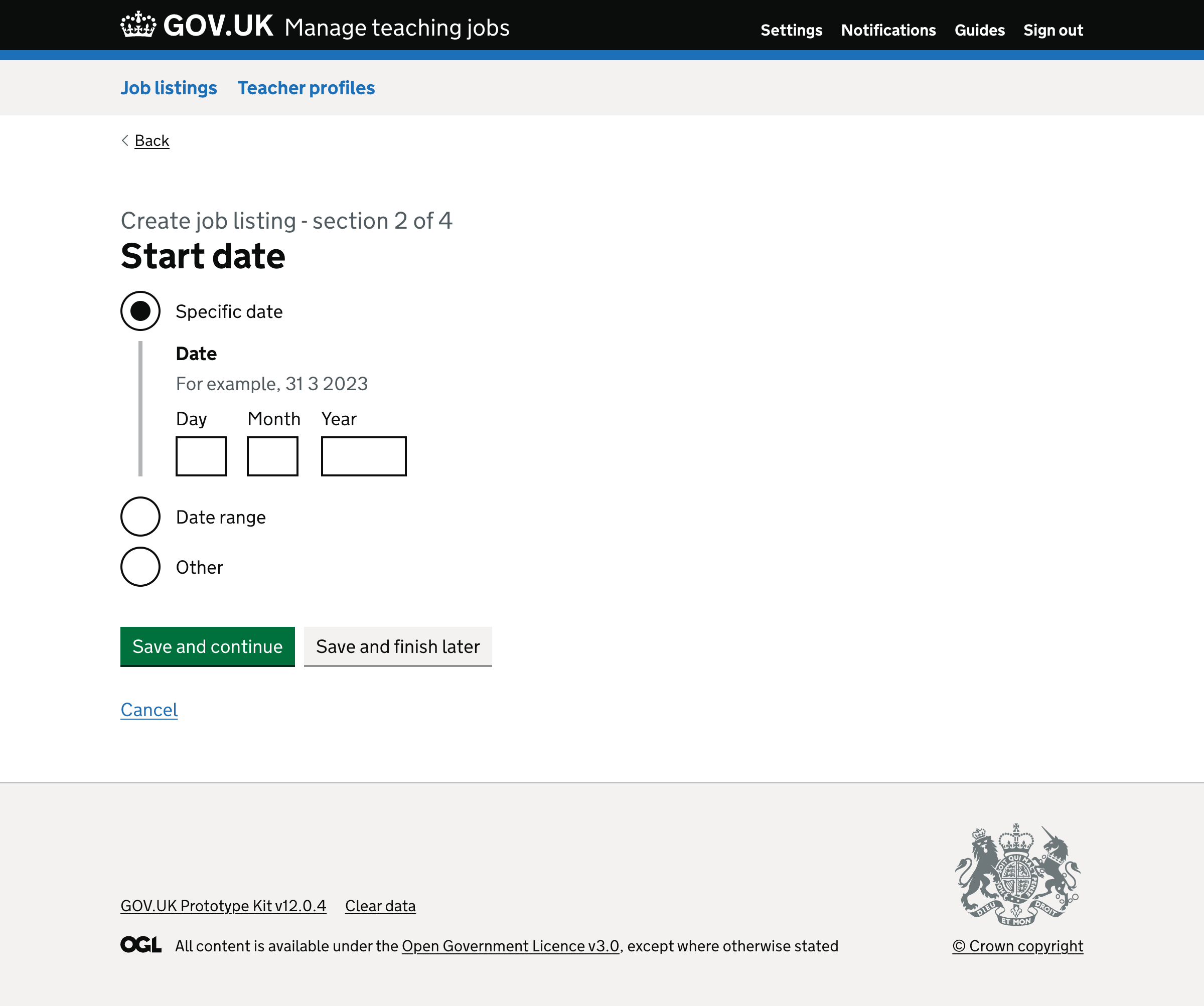
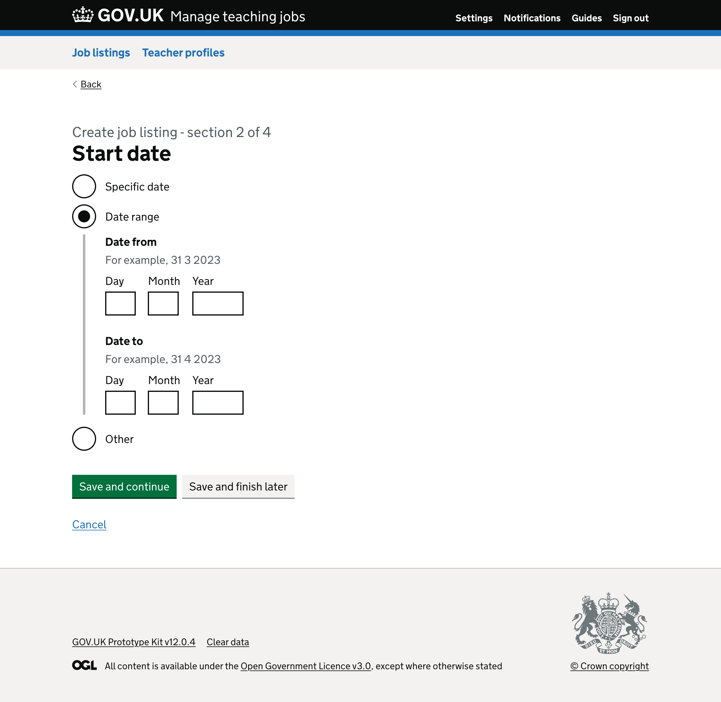
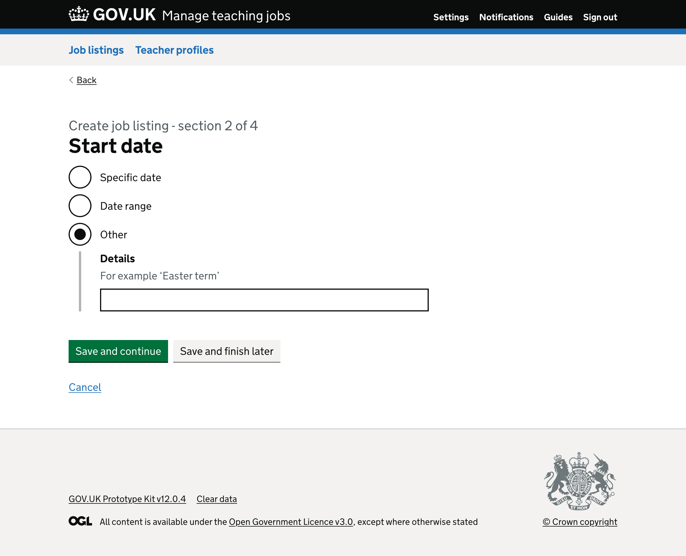
# Making start date required
Previously, start date was optional. It contained radio buttons labelled:
- ‘On a specific day’, which reveals a date input
- ‘As soon as possible’, which is vague
Research shows that users need to be able to enter:
- a date range, such as between 1 September 2022 and 30 September 2022
- a description such as ‘Easter term’
So we redesigned the field so that the start date is required, but contains all the options that users need. They are:
- ‘Specific date’, which reveals a date input labelled ‘Date’
- ‘Date range’, which reveals two date inputs labelled ‘Date from’ and ‘Date to’
- ‘Other’, which reveals a text box labelled ‘Details’ with hint text of ‘For example, Easter term’
# Publish date
Previously, we asked users to enter the ‘Date job will be listed’. It contained radio buttons labelled:
- ‘Today’
- ‘Tomorrow’
- ‘On another day’, which revealed a date input labelled ‘What date will the job be listed?’
To make this clearer and more concise, we changed:
- the question from ‘Date job will be listed’ to ‘Publish date’
- the labels for ‘Today’ and ‘Tomorrow’ to include the actual date in brackets so that users do not have to work it out
- the label for ‘On another day’ to ‘Another date’
- the label for ‘What date will the job be listed?’ to ‘Another date’
# Closing time
Previously, we gave users a field for ‘Time application is due’, which contained radio buttons for:
- 7am
- 8am
- 9am
- 10am
- 11am
- Midday
- 1pm
- 2pm
- 3pm
- 4pm
- 5pm
- 11:59pm
This is problematic because it:
- makes the page longer
- is not the most efficient way for users to enter a time
- does not give users a way to specify their own time
We changed the label from ‘Time application is due’ to ‘Closing time’.
We also changed the options to:
- 9am
- 12pm (midday)
- 11:59pm
- Another time
Selecting ‘Another time’ reveals a text input labelled ‘Time’. It also has a hint which says ‘For example, 2pm or 14:30’.
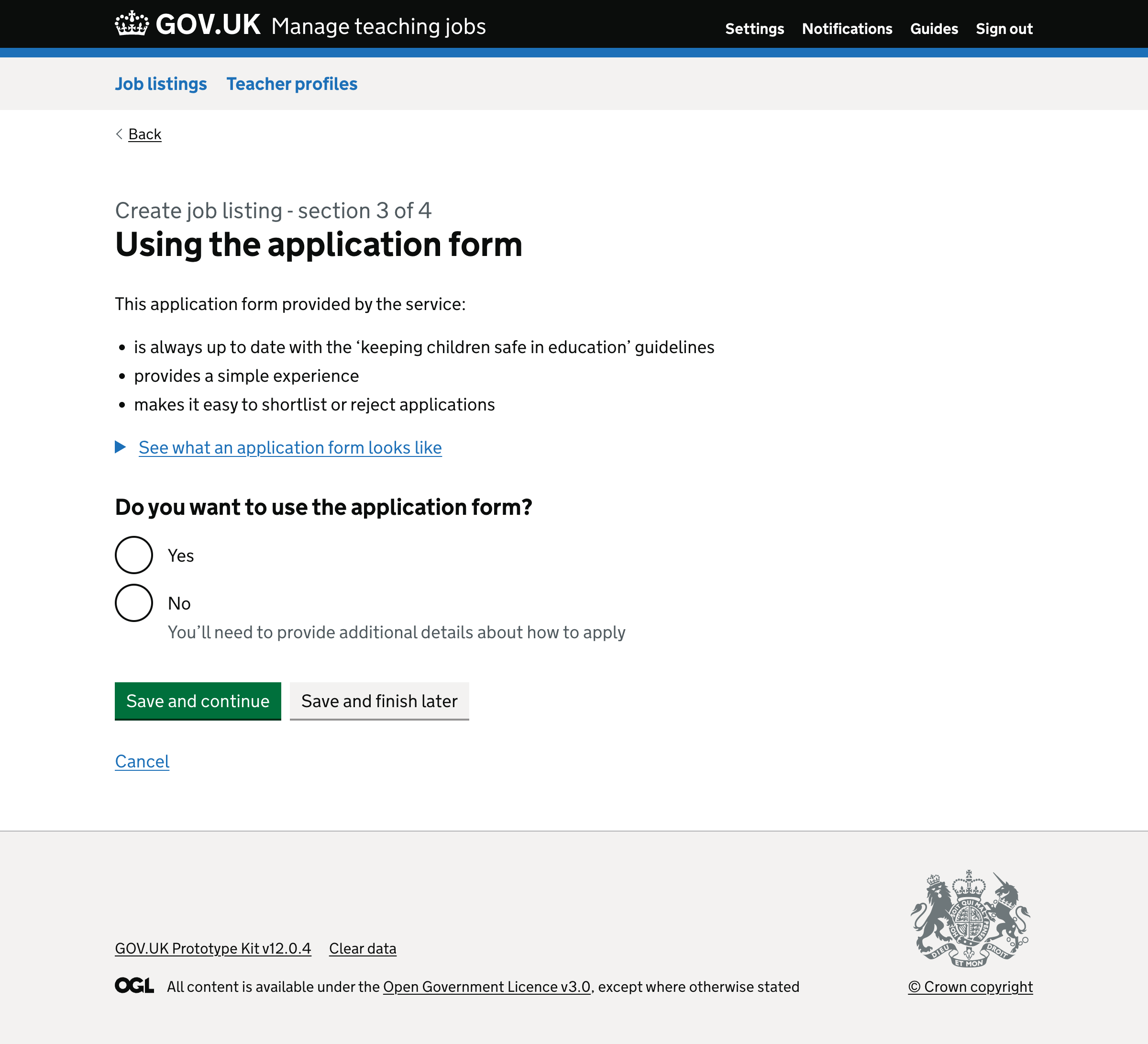
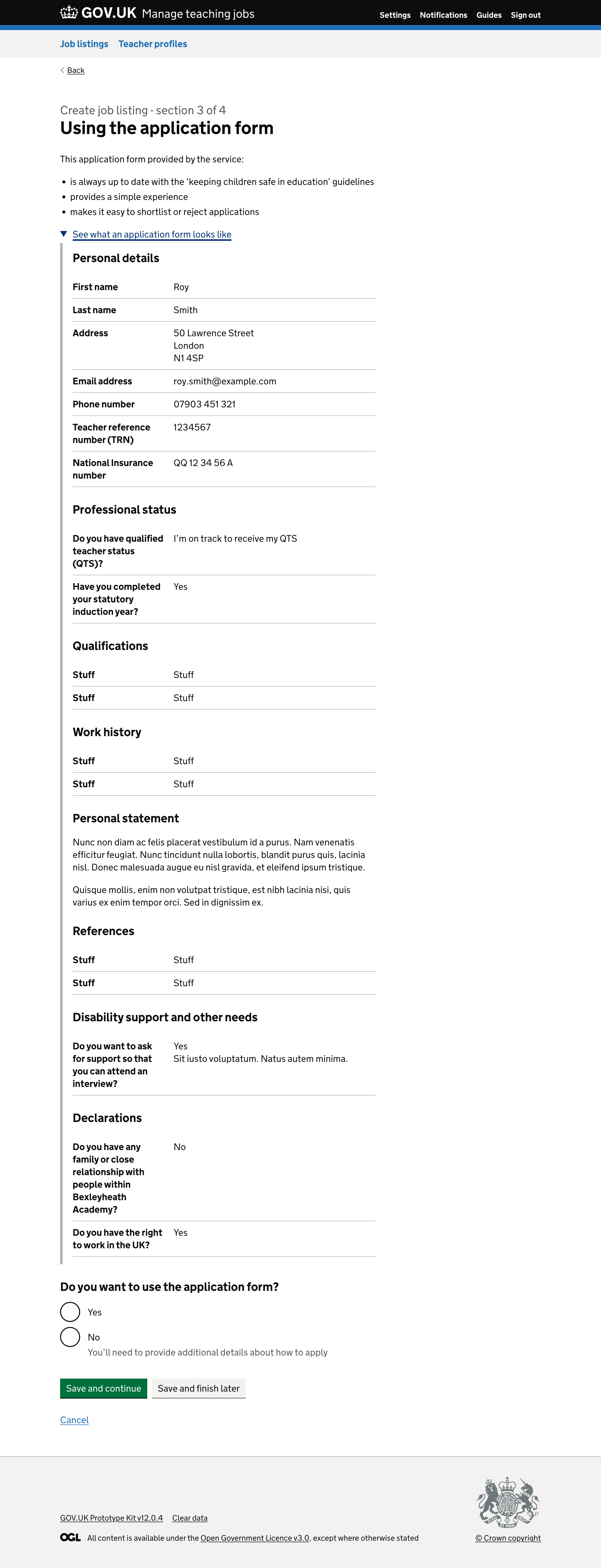
# Using the application form
Previously, we gave users a page titled ‘Applying for the job’.
This page contained guidance about the options and had a link to an article explaining the benefits of using the application form provided by the service.
Below this, there was a question labelled ‘How would you like candidates to apply?’ which contained 2 radio buttons.
The first was labelled ‘Use the Teaching Vacancies application form’ and had hint text that said ‘Receive and manage applications through Teaching Vacancies’.
The second was labelled ‘Use another application process’. This means the school had to provide either:
- a PDF application form for candidates to send to the school
- a link to their website for candidates to apply through
This page was problematic because:
- users had to click a link that takes them out of the flow to understand the options
- only 6% of job listings use the service’s application form
- we refer to the name of the service which users should not have to be aware of
We changed the page heading to ‘Using the application form’ to be clearer.
We summarised the benefits of using the application form as bullet points to be clearer.
We removed the link and added a details component that shows users what an application form will look like.
We changed the question label to ‘Do you want to use the application form?’, which is focused on the user instead of the candidate.
The options are:
- ‘Yes’
- ‘No’ with hint text saying ‘You’ll need to provide additional details about how to apply’
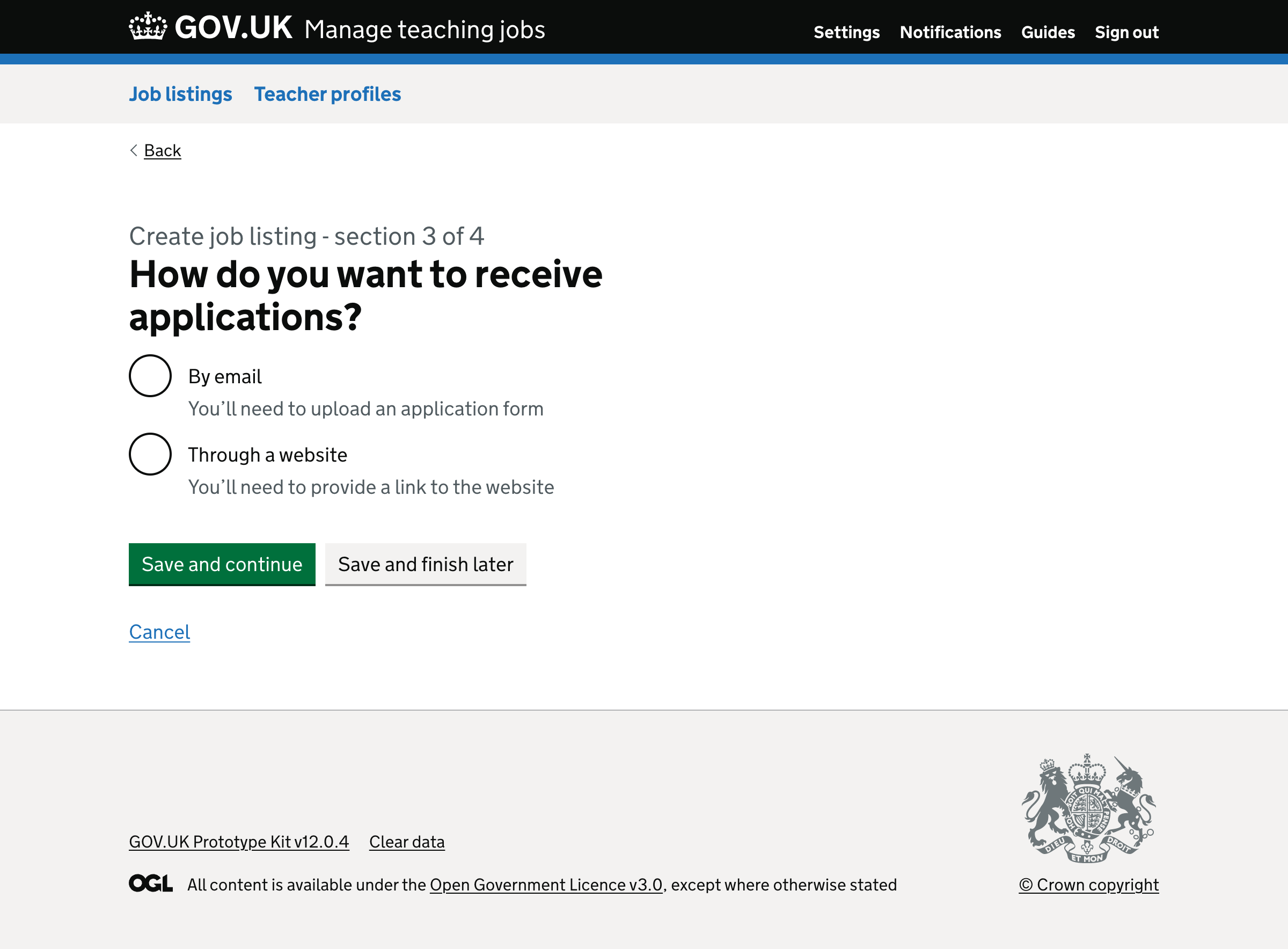
# Changing how users select to receive applications by email or through a website
Previously, users were taken to a page titled ‘Apply for the job’ if they do not use our application form. It contained fields labelled:
- Explain how to apply for the job
- Link to online application (optional)
- Upload an application form (optional)
- Contact email
- Contact phone number (optional)
- School visits (optional)
When users are explaining how to apply, they’re not sure whether the information will be shown on the job listing.
Users are also not sure if they’ll see these applications when they sign in or whether they’ll be sent to the contact email address.
Furthermore, users often enter their email address and phone number into this field. This means the same information is shown multiple times within the job listing.
So, we removed this field.
Another problem is that the fields labelled ‘Link to online application form’ and ‘Upload an application form’ are marked as optional when one must be entered.
So, we’ve split this page up into simple steps.
Firstly, users are taken to a page that asks users ‘How do you want to receive applications?’. It contains radio buttons labelled:
- ‘By email’ with hint text saying ‘You’ll need to upload an application form’
- ‘Through a website’ with hint text saying ‘You’ll need to provide a link to the website’
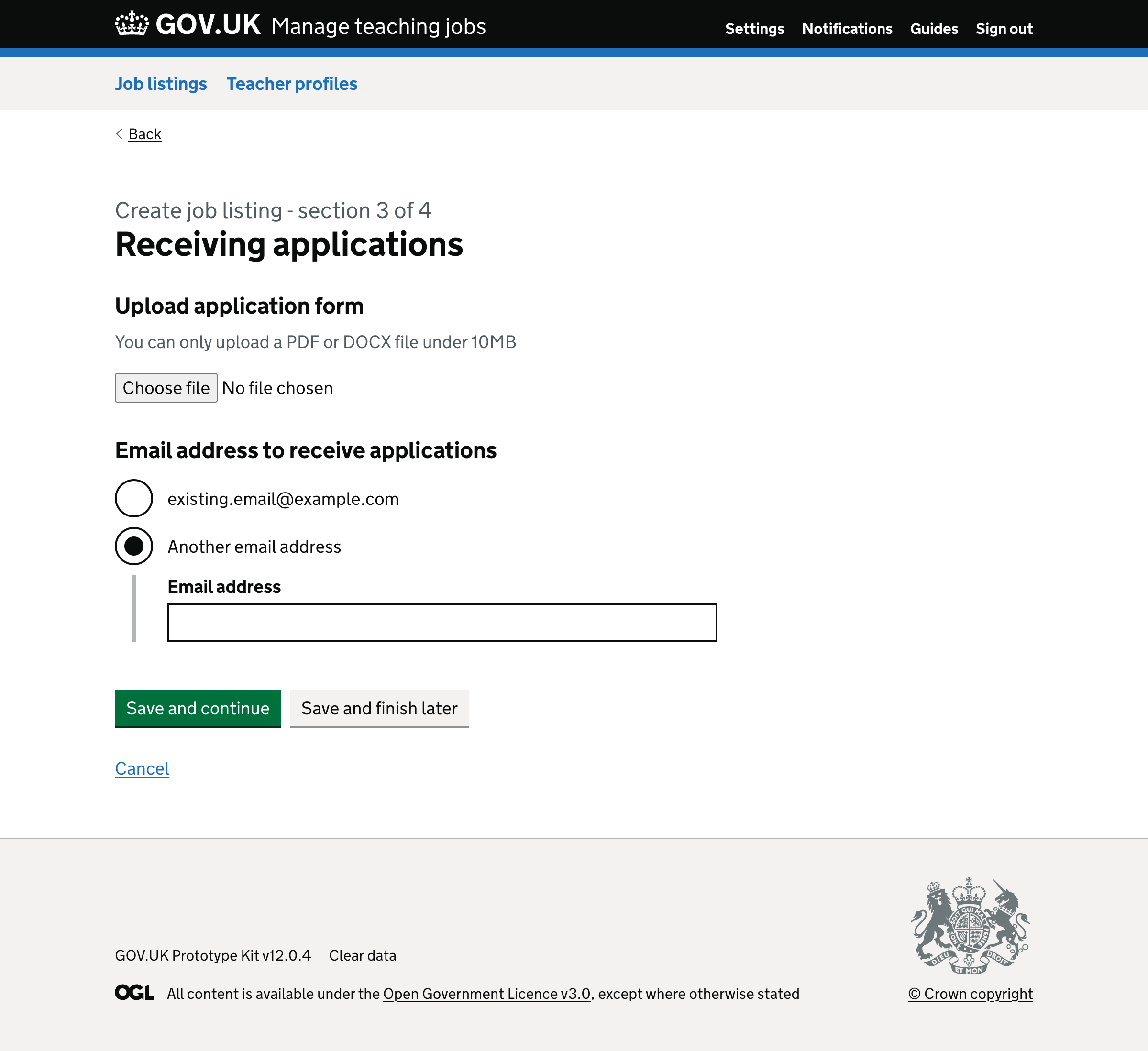
If the user selects ‘By email’ they’re taken to a page titled ‘Receiving applications’.
The first question is labelled ‘Upload application form’ and has a hint of ‘You can only upload a PDF or DOCX file under 10MB’.
The second question is labelled ‘Email address to receive applications’.
The first radio button is labelled as the user’s email address - for example, adam@example.com.
The second radio button is labelled ‘Another email address’, which reveals a text box.
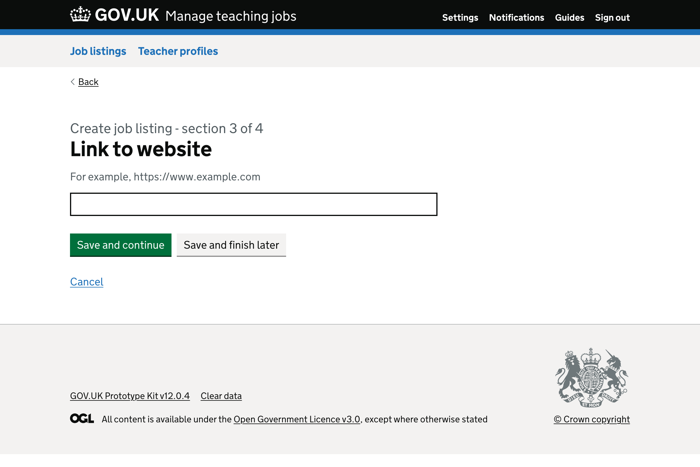
If the user selects ‘Through a website’, they’re taken to a new page with a question labelled ‘Link to website’.
The text box also has a hint that says ‘For example, https://www.example.com’.
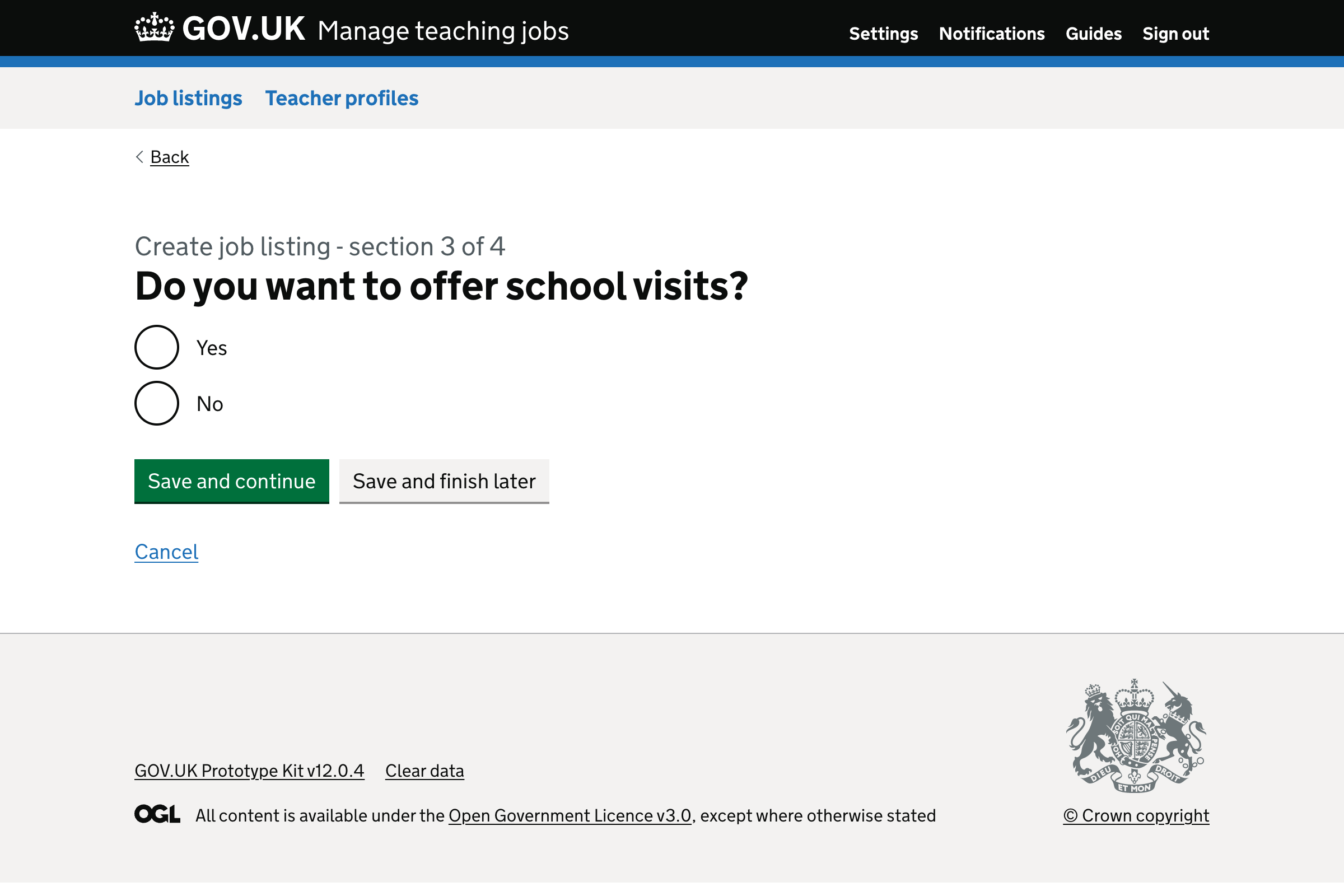
# School visits
Previously, users were given an optional field labelled ‘School visits’, which appeared at the bottom of the ‘Apply for the job’ page.
It allowed them to explain to candidates how to arrange a school visit.
But, this is problematic because users often repeat the same contact information, which then appears multiple times on the job listing.
Different job listings indicate that the school encourages school visits but they say it in inconsistent ways.
Also, not all jobseekers realise that forming a relationship with people at the school increases the chance of them getting a role there.
So, we changed the question to ‘Do you want to offer school visits?’ with yes-no radio buttons.
If the user selects ‘Yes’ then the job listing will have a section titled ‘Arranging a school visit to [name of school]’.
Within this section is a paragraph that says ‘To arrange a visit and increase the chance of a successful application email [email address].’
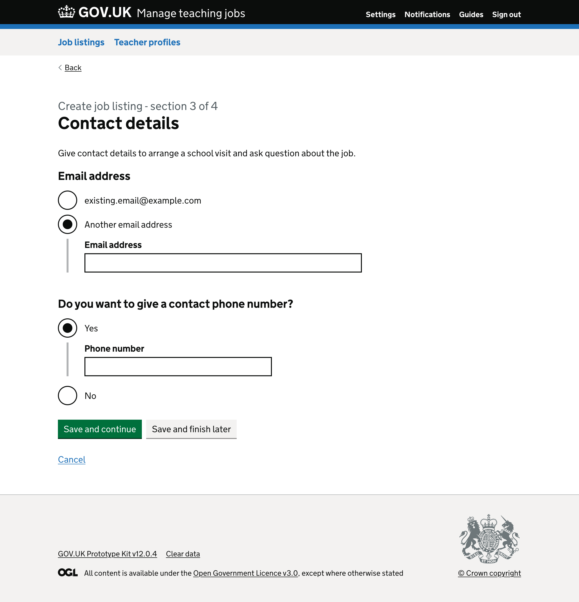
# Contact details
Previously, on the ‘Apply for the job’ page there was a field for entering:
- an email address, which is required
- a phone number, which is optional
As we no longer have this page, we created a new page titled ‘Contact details’.
It has guidance saying ‘Give contact details to ask questions about the job’.
The first question is labelled ‘Email address’.
The first radio button is labelled as the user’s email address - for example, adam@example.com.
If the user chooses to receive applications by email and gave another email address, it’ll be the second radio button.
The last radio button is labelled ‘Another email address’, which reveals a text box.
To avoid optional fields, we changed the second question to ‘Do you want to give a contact phone number?’ with yes-no options.
Selecting ‘Yes’ conditionally reveals a text input.
# Removing the ‘Help candidates to write their personal statement’ question
Previously, users were given an optional field to enter information about how to write a personal statement.
We removed this question because analysis shows that only 2% of job listings provided this information. We also provide this guidance to candidates separately as longform content.
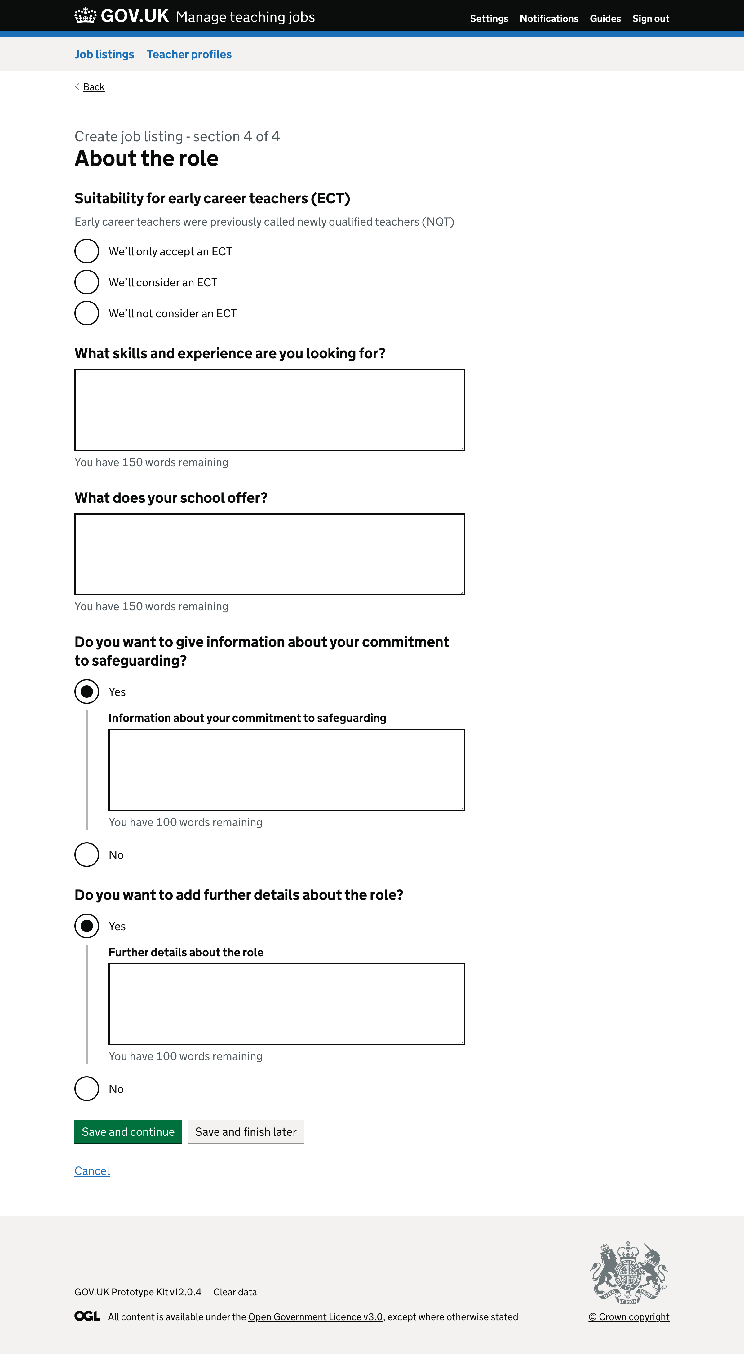
# Splitting ‘Job advert’ into multiple questions
Previously, users were given a page titled ‘Job summary’ with fields labelled:
- ‘Job advert’
- ‘About [name of school]’
The ‘Job advert’ question contained a lot of hint text explaining:
- how many words to use
- what to type
- that the first 20 to 40 words will appear in the search results
But, hint text is easy to ignore, and it gives screenreader users a poor experience as the entire hint text is read out every time a user focuses the input.
Research shows that users:
- find following instructions overwhelming
- like knowing they should keep the details precise
- duplicate content such as ‘about the school’
- try to enter headings which are shown as paragraphs
- enter information that jobseekers do not find useful
- request formatting options like bold
So, we replaced the question with 4 new ones.
The first question is ‘What skills and experience are you looking for?’. This field uses a character countdown with 150 words.
The second question is ‘What does your school offer?’. This field uses a character countdown with 150 words.
The third question is ‘Do you want to give information about your commitment to safeguarding?’ with yes-no radio buttons.
Selecting ‘Yes’ reveals a text box labelled ‘Information about your commitment to safeguarding’. This field uses a character countdown with 100 words.
The final question is ‘Do you want to add further details about the role?’ with yes-no radio buttons.
Selecting ‘Yes’ reveals a text box labelled ‘Further details about the role’. This field uses a character countdown with 100 words.
We think this will help users enter concise and clearer information relating to each question.
# Removing ‘About school’ question
Previously, we asked users to enter information about the school.
The field was populated from information entered in school settings. If the user makes changes from within the create job listing flow, it does not update the information in school settings.
This is problematic because users may end up making the same changes every time they create a new job listing.
Another problem is that users provide information about the school in the ‘job advert’ field. This is wasted effort and duplicates the information on the job listing.
So, we removed this field because:
- the job listing can pull this information from the school settings
- the user can put relevant information into the new ‘What does your school offer?’ field
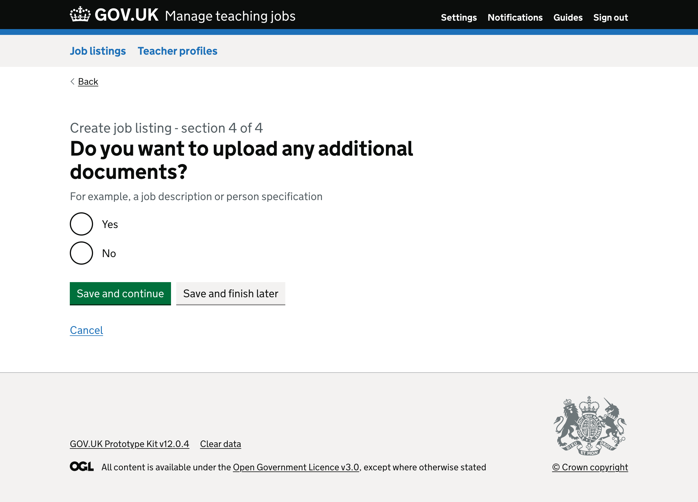
# Uploading additional documents
Previously, users were given the option to upload additional documents containing information about the role.
This is problematic because we do not want users to upload files because:
- they’re often inaccessible
- the content will not appear directly on the job listing
We’ve also found that:
- 25% of uploaded files go onto be deleted later
- most users provide additional documents
- most job listings contain one or 2 extra files
- users want to reorder the files they upload
We think this is because:
- users do not realise that they’ll later be given the opportunity to enter information about the role in structured fields
- it’s not clear that the question is optional
So we have moved the ability to upload additional documents to the very end of the flow.
We also changed the flow so that users can easily understand that it’s optional. We’ll now ask users ‘Do you want to upload additional documents?’, which contains yes-no options.
Selecting ‘Yes’ will take the user to a new page where they can upload a file. The hint text says ‘Files are displayed in the order you upload them. You can only upload PDF or DOCX files under 10MB’.
Once the user submits the form, they’re taken to a page where they can:
- see a list of files they’ve uploaded
- delete a file they’ve uploaded
- see a question that asks ‘Do you want to upload another document’ with yes-no options
Selecting ‘Yes’ will repeat the steps. Selecting ‘No’ will take users to the ‘check answers’ page.
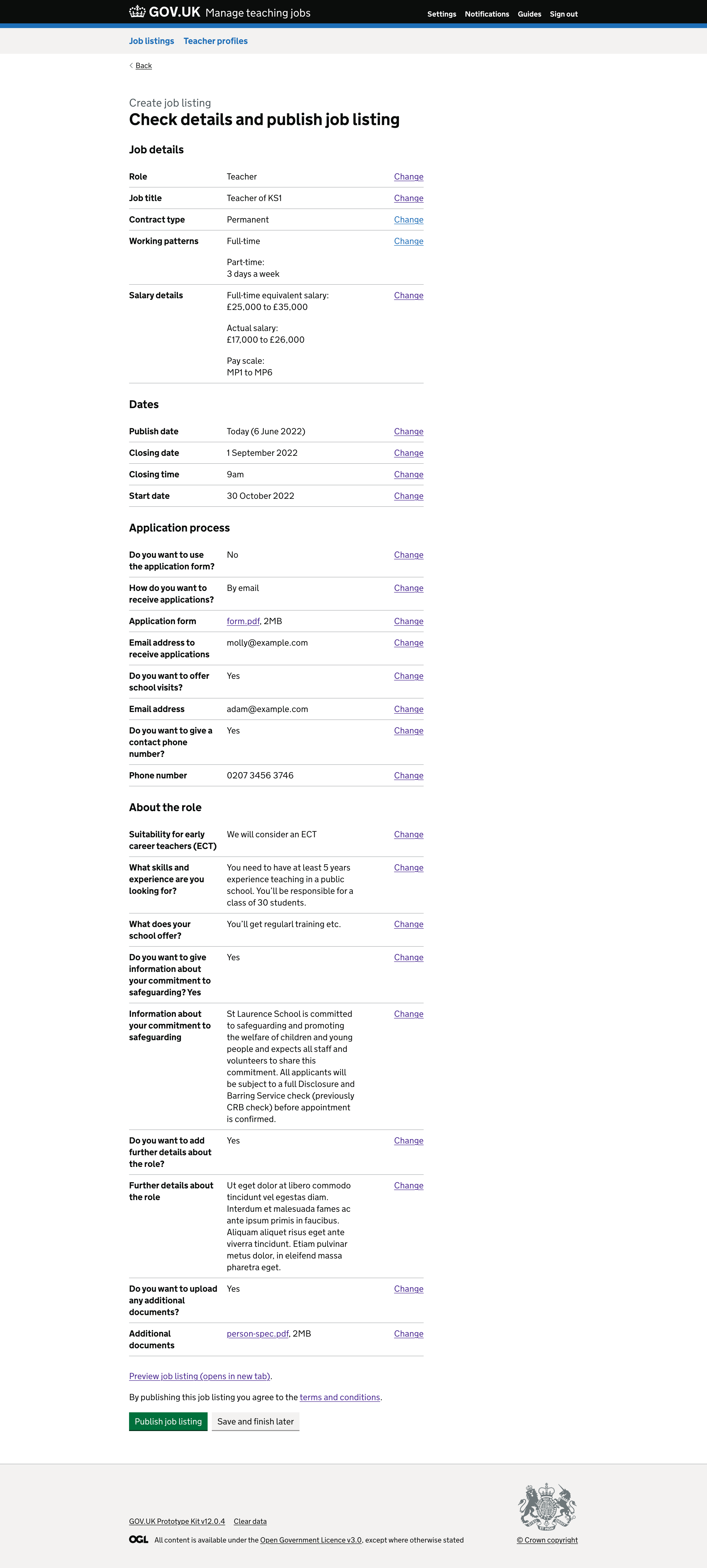
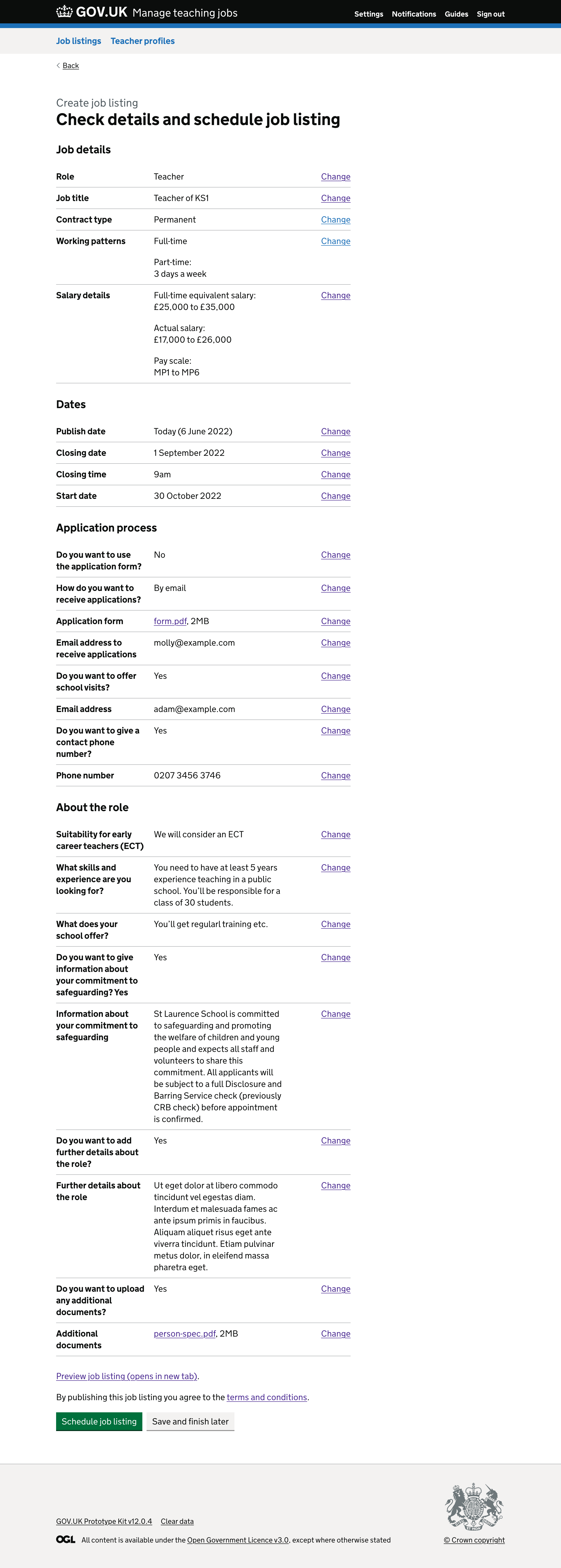
# Check answers page
The previous ‘check answers’ page did not use the ‘check answers’ page from the GOV.UK Design System.
For example:
- it contained status tags from the task list
- the sections were numbered
- the change links were aligned left next to the section headings
- there was a ‘Back to manage jobs’ link at the bottom
So, we changed this page to use a standard ‘check answers’ page. We also changed the heading from ‘Review the job listing’ to either:
- ‘Check details and publish job listing’, if publishing today
- ‘Check details and schedule job listing’, if not publish today
We removed:
- the paragraph that said ‘Review your entries for each section below, making any changes needed before you publish the job listing’ as it’s unnecessary
- the status tags as the user won’t be able to check their answers until everything is complete
- the numbers from each of the headings
- the ‘Back to manage jobs’ link
There’s also no way to save and finish the job listing later so we added a ‘Save and finish later’ button.
We reduced the length and fixed the style of the content about previewing a job listing and understanding the terms and conditions.
We now just have:
- a link labelled ‘Preview job listing (opens in new tab)’
- a paragraph that says ‘By publishing this job listing you agree to the [terms and conditions]’
If the job listing is being published today:
- the h1 heading says ‘Check details and publish job listing’
- the submit button says ‘Publish job listing’
If the job listing is being published in the future:
- the h1 heading says ‘Check details and schedule job listing’
- the submit button says ‘Schedule job listing’
# Previewing a job listing
Previously, when a user previewed a job listing, they were taken to a preview page with a notification banner at the top. It contained options to:
- publish the job listing
- go back and make changes
We removed the notification banner because:
- we now open the preview in a new tab
- it gets in the way of the job listing
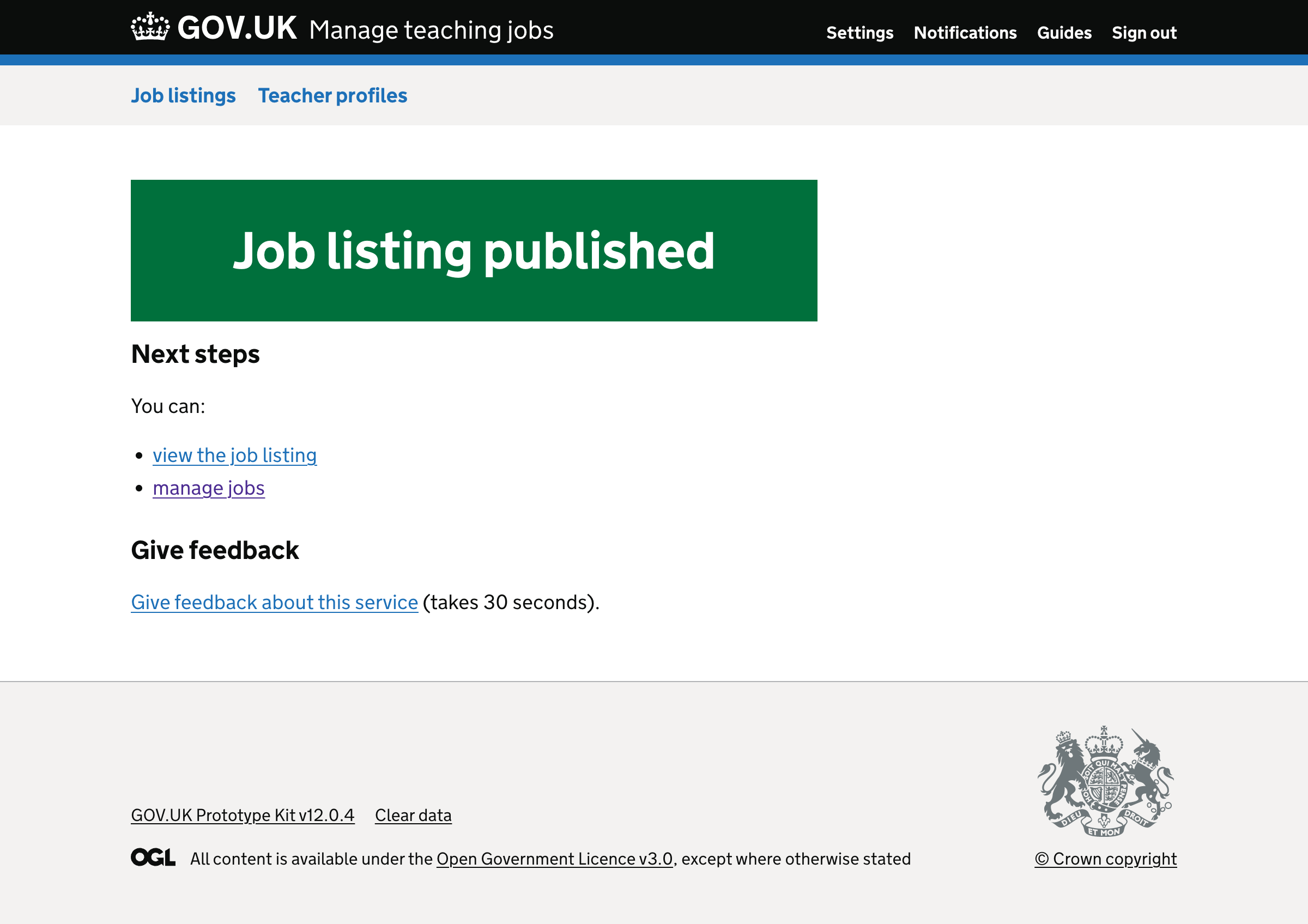
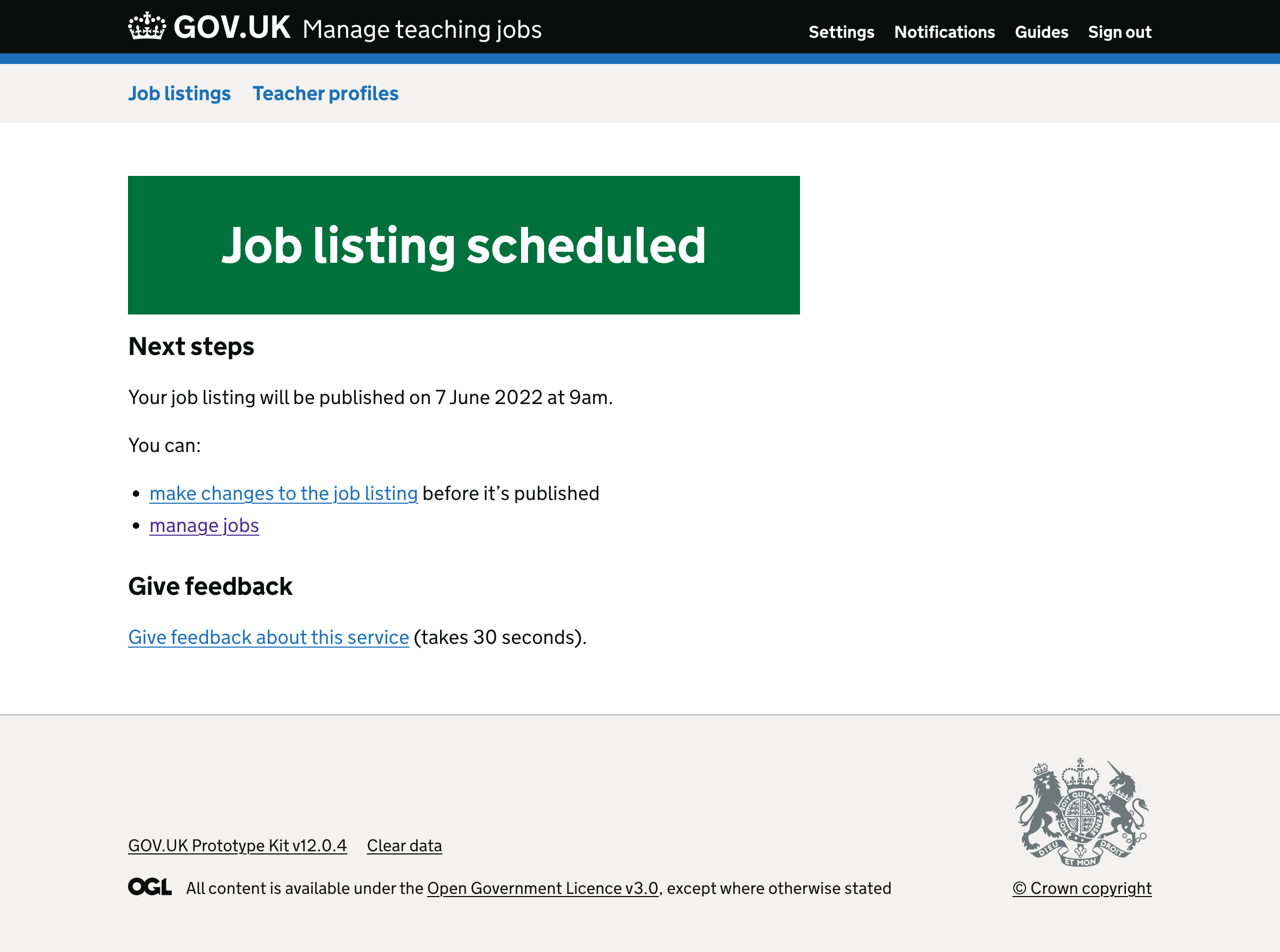
# Confirmation page
Previously, the confirmation page had:
- a ‘Share this job’ feature, but users did not understand what it was for
- a button to create another job listing, but users did not use it
- a feedback form, that users felt like they had to fill out
So, we removed the ‘share this job’ feature and button to create another job listing.
We also added a link to the feedback form instead so users realise this is optional.
We also made some changes to the content.
If the user selected to publish the job listing today, the h1 heading says ‘Job listing published’ with links to:
- view the job listing
- manage jobs
If the user scheduled the job listing to be published at a future date, the h1 heading says ‘Job listing scheduled for publication’ with links to:
- make changes to the job listing
- manage jobs
We also changed the subheading from ‘What happens next’ to ‘Next steps’.
# Further considerations
We want to consider:
- using the task list pattern
- ways to help users realise what roles are allowed on the service
- how to let users enter their school’s about section, commitment to safeguarding and contact details once while making sure they realise it’ll be added to all job listings
- ways to let users state whether they are a special school or whether they have a SEND department
- removing closing time
- ways to make users aware of the service’s application form before they create a job listing
- giving users the ability to reorder any additional documents they upload
- whether we need to encourage users to avoid uploading additional documents
- ways to help users make sure their uploaded documents are accessible
- ways to stop users from creating supply roles
# Screenshots
- Locations
- Age group
- Role
- Title
- Key stages
- Subjects
- Contract type
- Contract type - fixed term selected
- Contract type - maternity or parental leave cover selected
- Working patterns
- Salary
- Publish and closing dates
- Start date
- Start date - date range selected
- Start date - other selected
- Application form
- Application form - details expanded
- Receiving applications
- Upload application form
- Link
- School visits
- Contact details
- About role
- Upload additional documents - step 1
- Upload additional documents - step 2
- Upload additional documents - step 3
- Check answers - publishing today
- Check answers - scheduling for the future
- Confirmation page - published
- Confirmation page - scheduled