Uptake of the applications feature is low. Since September 2021, only 7.8% of teaching jobs listed in the service collect applications through Teaching Vacancies.
Though there are a significant number of people who are yet to learn of Teaching Vacancies, in this piece of work we wanted to improve the ways we signpost the application feature to our existing users.
We know from previous research that organisations are hesitant to collect applications through Teaching Vacancies without first seeing the application form itself. Also, it is generally not the staff who would typically use the service who would make decisions about what application tracking software their organisation uses.
# Where we started
In June 2021, we displayed a banner visible to logged in hiring staff. The banner contained a link to a static page outlining the data we ask for in our applications form. There were some perceived issues with this:
- There was no clear action to encourage hiring staff to engage with the feature. What was the user supposed to do? How were they supposed to find where to enable it?
- The notification banner was persistently visible and we were concerned it contributed to banner fatigue (sometimes referred to as banner blindness). There’s evidence that people often miss banners, and using them too often is likely to make this problem worse.
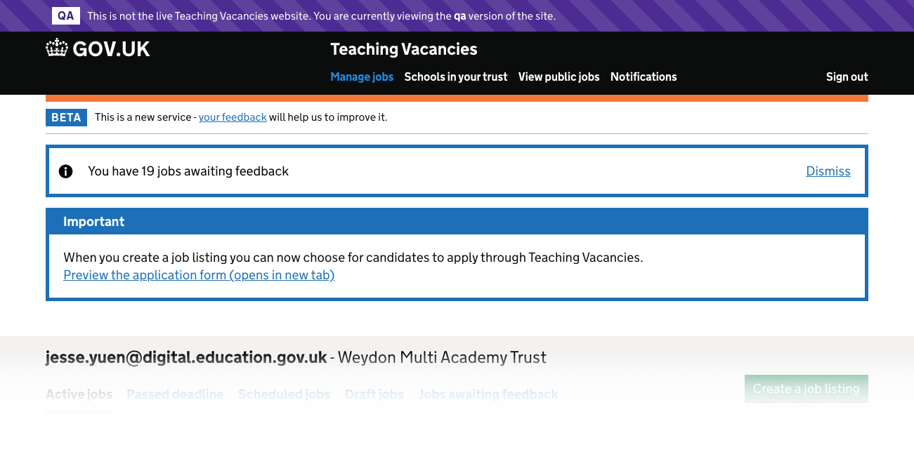
The original banner
# What we did
# Interstitial screen and an applications guide
We replaced the banner with an interstitial screen that hiring staff encounter on their next login. The screen remains visible on each login until they dimmiss it or until the organisation uses the applications feature. The screen also contains a link to a downloadable pdf that:
- shows the applicants view of the applications form
- elaborates on some of the branching logic within the form
- gives a high level preview of the screens where users can manage applications
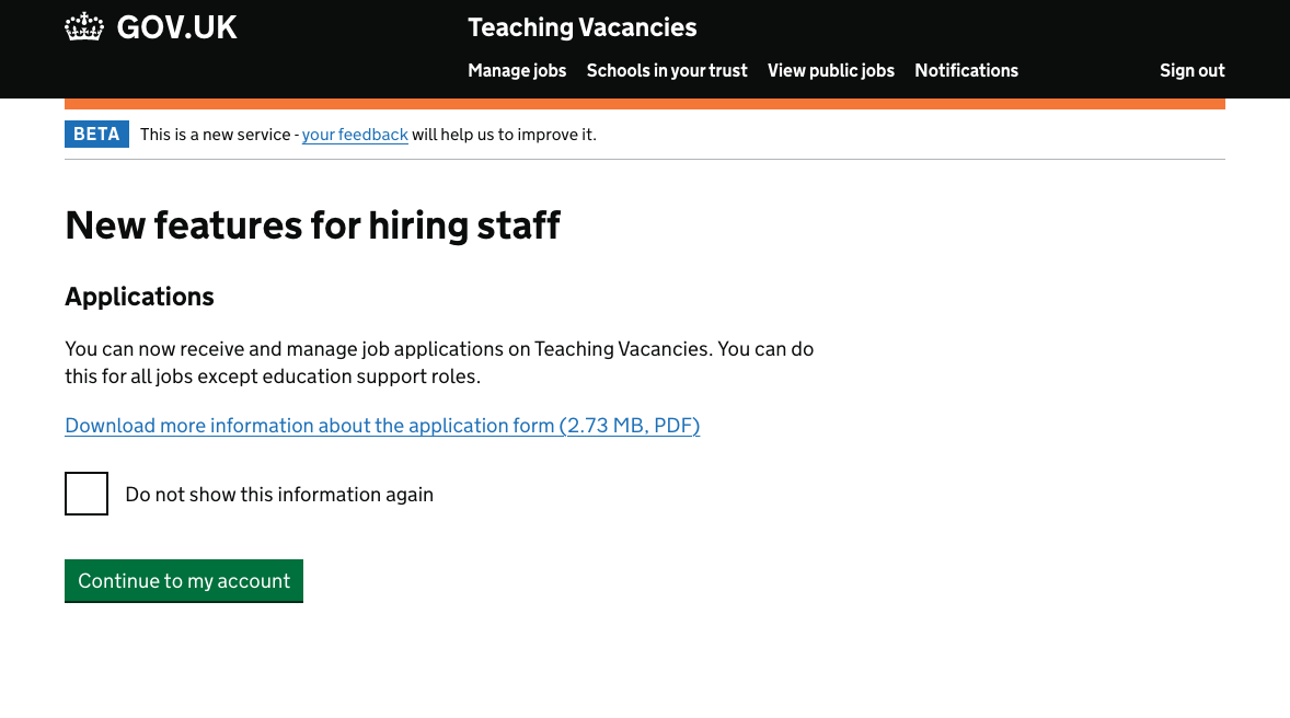
The applications guide was intended to be a cheap way to communicate more about the applications feature without hiring staff having to first create a job and enabling application collection.
# A reminder screen
We’re also experimenting with reminding hiring staff about the application feature at the start of the create a job flow. Currently, users decide if they will collect applications at the ‘how to apply’ step, which is half way through the create a job form. We are concerned that asking users halfway through the flow is the wrong time for them to make such a pivotal decision.
Our hypothesis is that by intercepting them earlier in the flow, we will give them a chance to consider their choices.
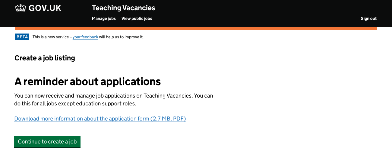
Hiring staff will only see this screen if:
- they have already seen the ‘New features’ page
- they have published one job listing since seeing the page
- the job listing did not accept applications through Teaching Vacancies
# Next steps
We will be monitoring the success of these screens as well as the download rates of the applications guide.
The contents of the guide itself would be more accessible online (as opposed to pdf) so we should consider where we publish it.
We should introduce a sandbox environment, a live, practice environment where hiring staff can explore and experiment with the features our service currently offers.