We want to encourage jobseekers to create accounts so that they have access to a greater range of functionality - better management of job alerts, and the ability to save and apply for jobs. One opportunity they have to do this is immediately after creating a job alert. We previously established that job alert creators would be more likely to create an account if presented with an inline form, rather than a link to a form on a separate page. However, we wanted to iterate further on this design to see if it would be possible to improve the account creation rate even further.
# Hypothesis
If we use more colour to highlight the account creation form in the job alert confirmation screen, more users will create accounts when they create job alerts.
# Who we tested with
We tested with 751,676 jobseekers between 17 May and 28 September 2021. One third of users were assigned each variant.
# Findings
If the test were to be repeated, we would expect:
- 0.25% of jobseekers to create an account if shown a plain form underneath the notification confirming that they had successfully create a job alert
- 0.20% of jobseekers to create an account if shown a form in a blue box on the right hand side of the screen
- 0.22% of jobseekers to create an account if shown a form in a light grey box on the right hand side of the screen
For comparison, around 1.3% of jobseekers currently create job alerts. Around 1 in 5 job alert creators create an account, but this dropped to 1 in 6 for the worst performing variant tested.
The findings above indicated that our original hypothesis was, in fact, false. We think that it is possible that making the form more visible through colour and positioning actually made it feel ‘separate’ to the job alert creation process, reducing the account creation rate.
# Screenshots
These are the three designs we tested.
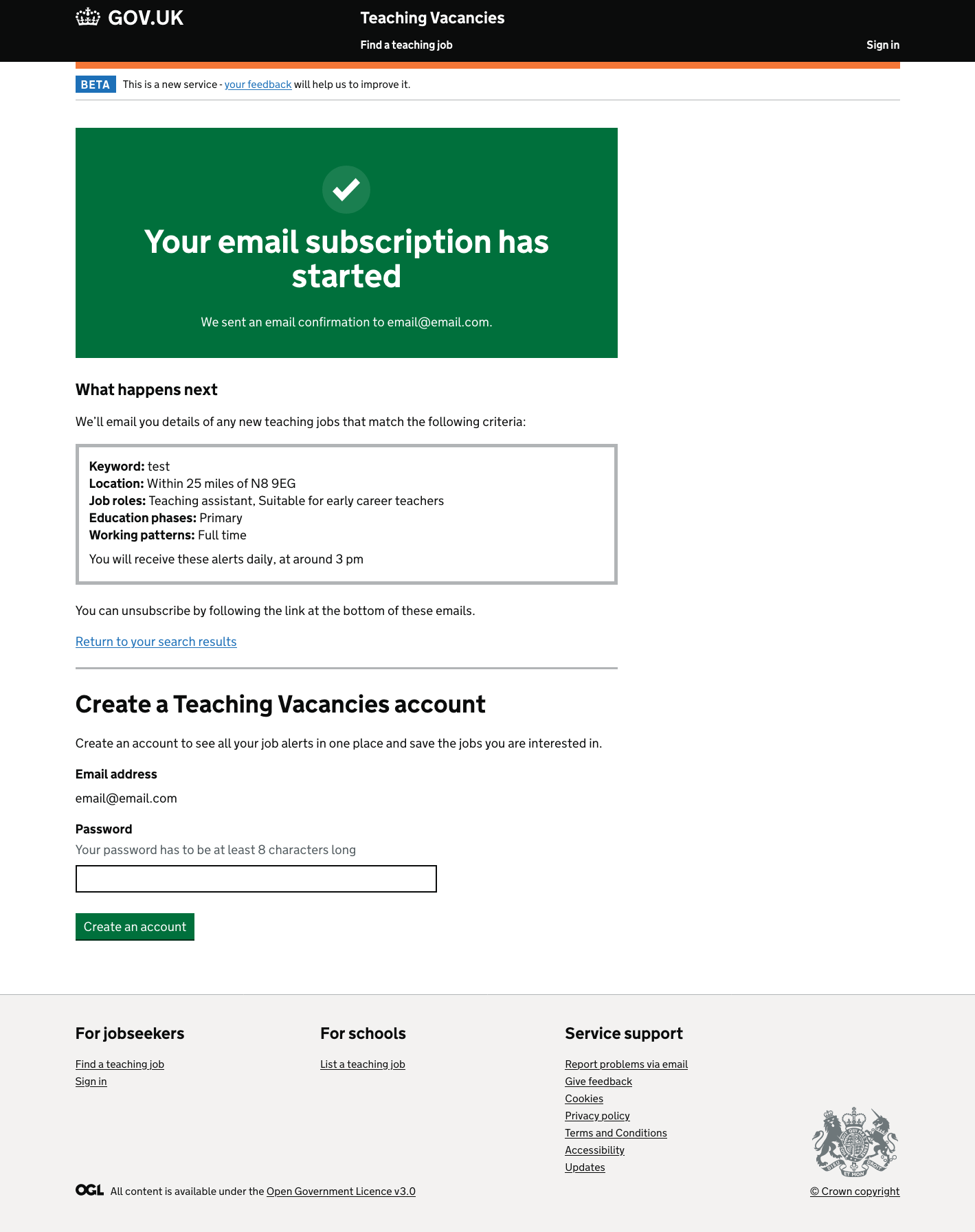
The account creation form inline.
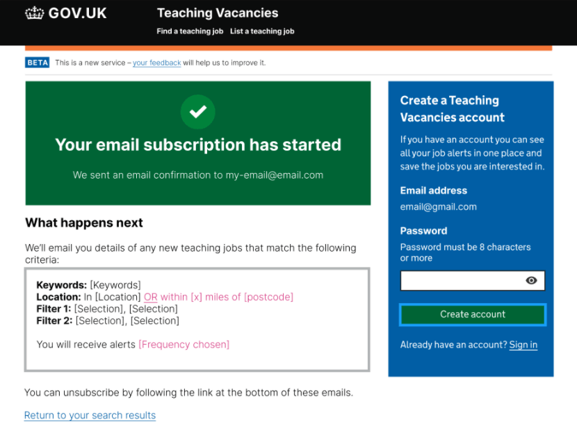
The create an account form in the sidebar with a blue background.
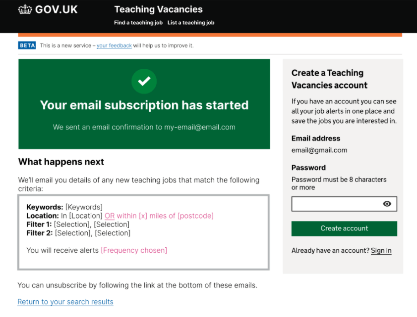
The create an account form in the sidebar with a grey background.
# Next steps
Based on these findings, we decided to revert back to the original design (with the inline form at the bottom of the screen). We also agreed to carry out a further test to see whether including the password field as an optional field in the job alert creation form, instead of as a separate step after job alert creation, would drive up the account creation rate, but without reducing the job alert creation rate.