On mobile devices, most of the search results screen is taken up with search refinement functionality rather than the results themselves. Users have to scroll down to see the results. We thought it might engage users better if they could see the results first, and only see the search refinement functionality if they choose to open a pop up screen.
# Hypothesis
If we move the keyword and location fields into a pop up screen on mobile devices, more users will engage with the results and so be more likely to find relevant ones.
# Who we tested with
We tested with 188,927 jobseekers on mobile devices between 17th November 2021 and 6th January 2022. 50% of users were assigned each variant.
# Findings
If the test were to be repeated in identical conditions:
- 17.2% +/- 0.2% of jobseekers would open a vacancy from a search results page if the keyword and location were collapsed into a pop up screen. 4.3% +/- 0.1% of these jobseekers would use filters to refine a search, and 20.1% +/- 0.3% would refine a search without using filters.
- 18.3% +/- 0.3% of jobseekers would open a vacancy from a search results page if the keyword and location were not collapsed into a pop up screen. 3.1% +/- 0.1% of these jobseekers would use filters to refine a search, and 27.0% +/- 0.3% would refine a search without using filters.
So, collapsing the keyword and location fields into a pop up screen for mobile users did encourage more users to engage with the filters. However, it also significantly reduced the proportion of users who refined their search overall, and reduced the proportion of users who opened a vacancy from a search result.
Given that most viewers of this screen (53%) refine their search before finding a relevant listing, and for a further 16% of viewers this screen is the first screen that they see, so they have yet to enter any search criteria themselves, it’s likely that the new design discourages them from doing this by putting the refinement functionality an extra click away, reducing the proportion who eventually find a relevant listing by directing them to unrefined, less relevant results instead.
# Screenshots
The two versions of the search results page on mobile devices which we tested are below.
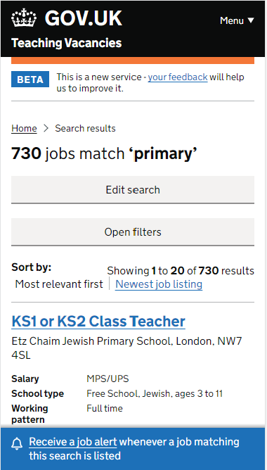
Variant with keyword and location fields collapsed into a pop up screen.
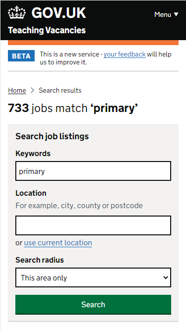
Variant with keyword and location fields visible.
# Next steps
Based on these findings, we decided to retain the existing functionality. Collapsing the fields reduced the proportion of users whose needs were met by the service.