We ran this A/B test to understand how introducing map-based search results would impact the jobseeker search journey. Using a map will affect future work on a new “commute time” feature, so we needed to identify if introducing a map would have a negative effect on a jobseeker’s user journey.
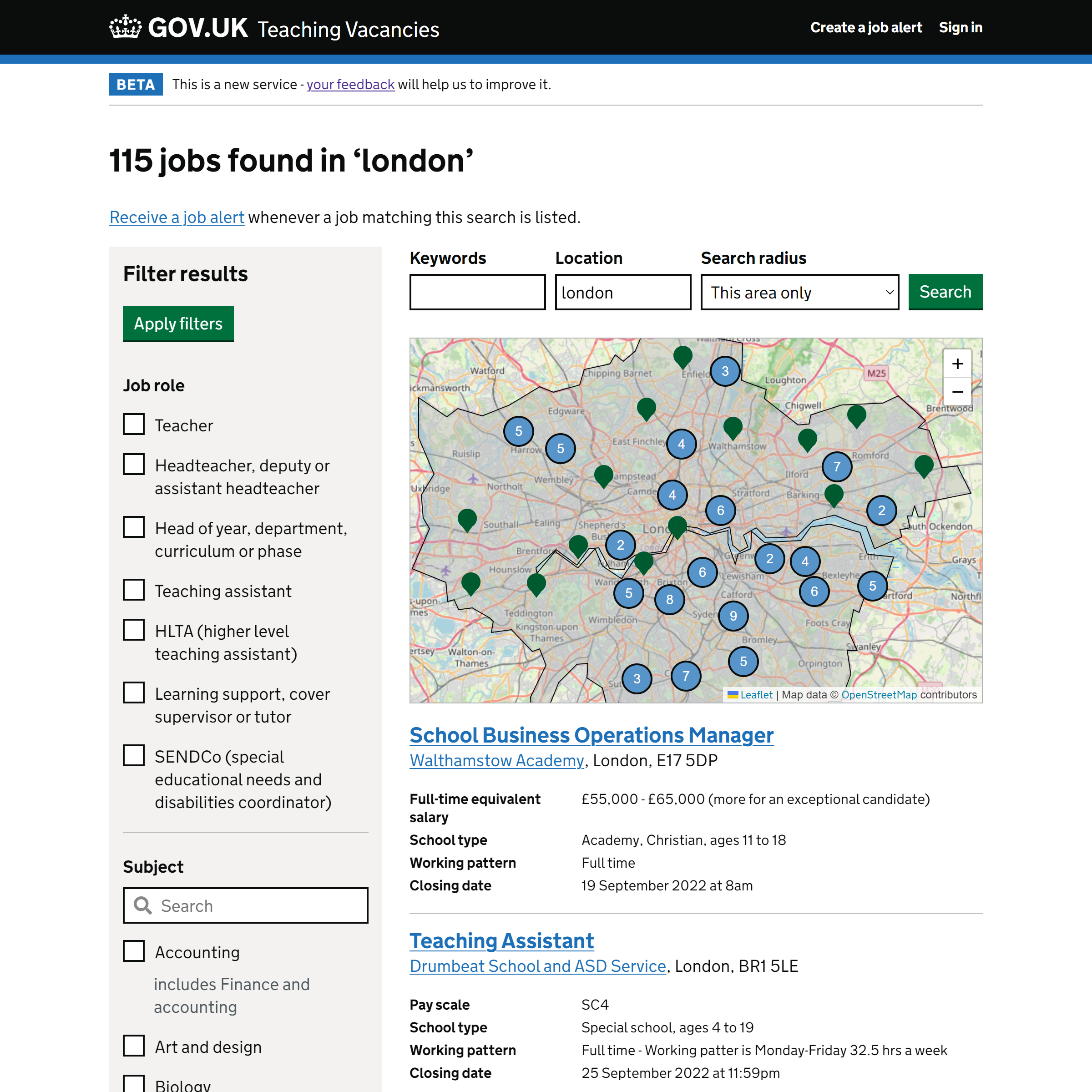
We tested two variants; the first showed search results on a map, which displayed if a user specified a location, and between 1 and 500 results were available. The second only presented search results in a list.
# Hypothesis
If search results are presented on a map then jobseekers will see more relevant search results.
# Who we tested with
We sampled 246,500 searches between 30 May 2022 and 26 June 2022. 50% of users were assigned to each variant.
No statistical tests were carried out on the data; owing to the complexity of the requirements, this was an ad-hoc piece of analysis which was not able to re-use our standard A/B testing code. However, the sample sizes were large, indicating that the results are likely to be statistically significant.
# Results
The following analysis only applies to search results where the new map feature was displayed to the user, or ‘would’ve been’ displayed to the user if they had been assigned the map variant. Therefore, they only include:
- Searches with between 1 and 500 results
- Searches that specified a location
# Findings
Overall, the results suggest that the map makes no observable difference to whether users are able to find a relevant vacancy. However, the map may slightly reduce the number of less relevant vacancies viewed, reducing friction in the user journey.
In detail:
-
When users were presented with the map, they were slightly less likely to view a vacancy from search results. This could be seen as a negative outcome, as it would mean vacancies had less exposure to jobseekers. However, this is more likely to be because users are better able to identify that the vacancies that they have searched for are not in suitable locations before spending time considering them in more detail - arguably a positive outcome.
-
95% of the time, users clicked on a job advert in the list at the bottom of the results, not the map. This could be because:
- There are significant usability issues with the map that make it a challenge for users to know they can click on a vacancy directly from the map.
- The map does not provide sufficient information to allow users to determine whether or not they are interested in finding out more about a vacancy.
- The map is a design pattern that users are not used to clicking on and using for navigation (cf. the Google Maps mobile design that displays a list more prominently than the results on the map). Could users be used to using a map to browse within a page, but a list to make a navigation decision?
-
Showing users a map made no significant difference to how likely they were to download a document from a vacancy, and no difference to how many vacancies they viewed.
# Next steps
Ultimately, this test does not confirm nor deny whether Teaching Vacancies can meet more users’ needs with the map feature. We fully implemented the map-based search results because there was no evidence that jobseeker journeys were adversely disrupted by them, and they will be necessary for showing commuting times on job listings in the future. Furthermore, we may test different designs of the map in the future.