We want to encourage jobseekers to create accounts so that they have access to a greater range of functionality - better management of job alerts, and also the ability to save and apply for jobs. One place they can do this is the home page. We experimented with several designs to make the account creation button on the home page more visible. However, we also wanted to see whether it would be possible to do this without reducing the proportion of users who engaged with more important functions of the site, like searching and finding vacancies.
# Hypothesis
If we allow home page viewers to create accounts from a sticky bottom banner or white box instead of a blue box then more of them will create an account without any negative impact on their engagement with listings and site search.
# Who we tested with
We tested with 209,526 jobseekers between 18th March and 11th April 2021. 50% of users were assigned each variant.
# Findings
If the test were to be repeated, for every 100,000 jobseekers we would expect:
- 150 to create an account with the original invitation to create an account - a blue box on the right hand side of the home page, titled ‘Save jobs you are interested in’, with a light grey ‘Create an account’ button at the bottom of the box
- 280 to create an account with a sticky banner at the bottom inviting them to create an account - however, an additional 1,800 would click on the button but not go on to create an account, and 1,400 fewer people would complete a site search
- 210 to create an account if we gave the invitation to create an account a white, contrasting background and a green button - however, this design diverged from the GDS design pattern because it placed a second green button on the page, instead of distinguishing between primary and secondary calls-to-action (CTA)
# Screenshots
These are the three designs we tested.
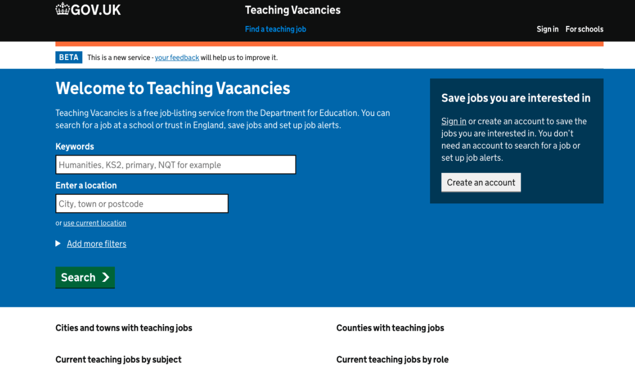
The default, as-is design
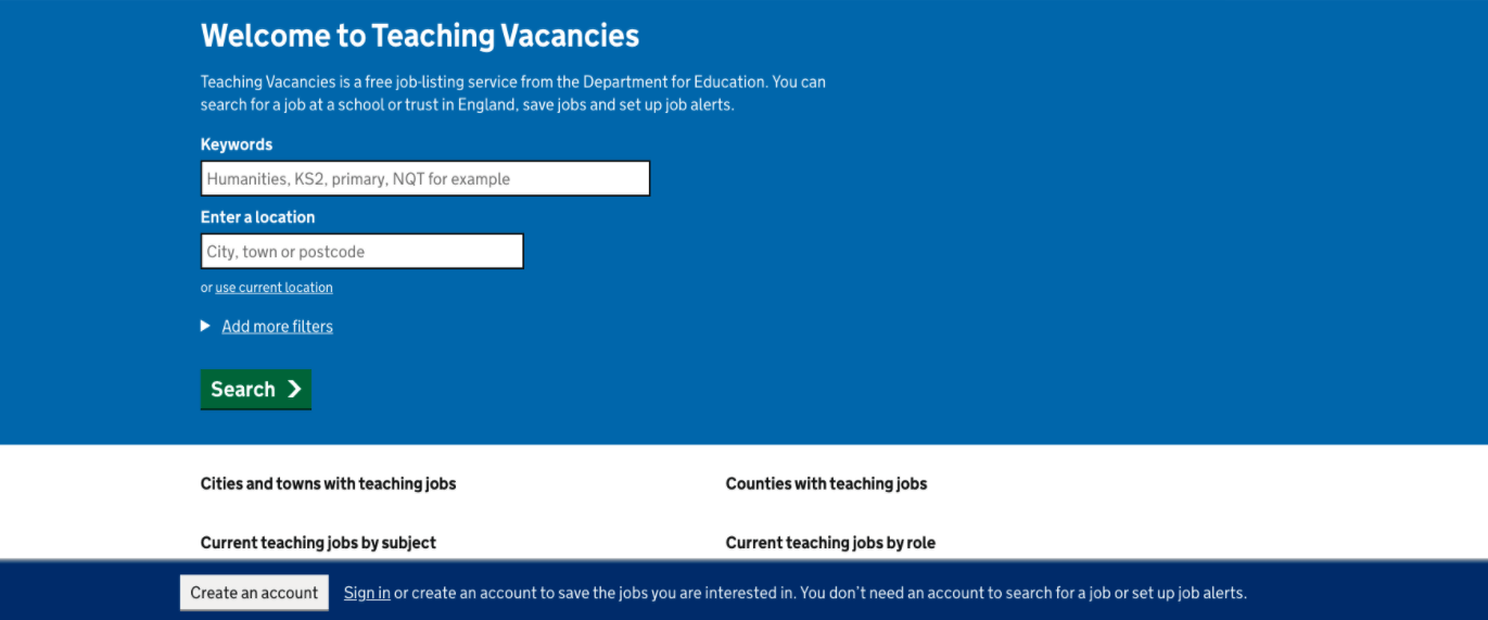
Variant 1: A sticky bottom panel
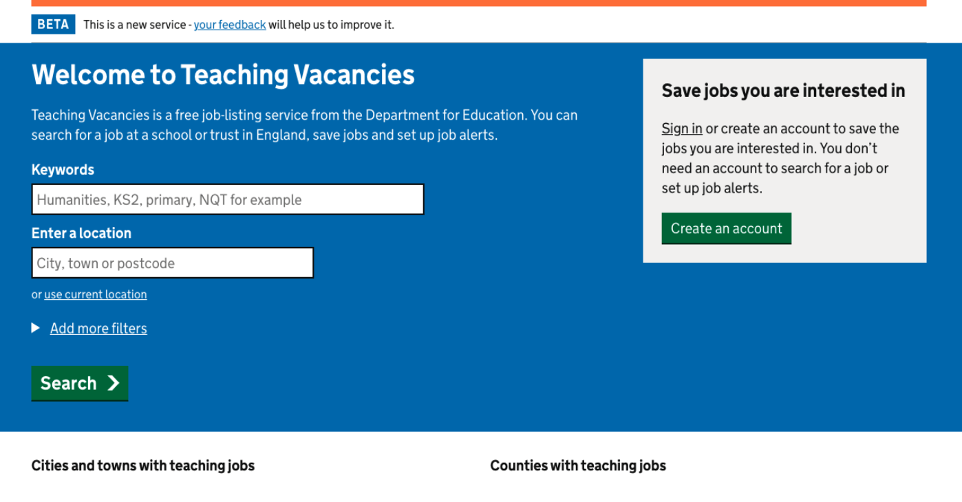
Variant 2: Alternate colours for the box and button
# Next steps
Based on these findings, we decided to retain the existing design. We decided not to switch to a sticky banner at the bottom because it distracted many more users from site search than it enabled to create accounts. We decided not to switch to the white background with green button because the benefits were not large enough to warrant diverging from a GDS design pattern.